You signed in with another tab or window. Reload to refresh your session.You signed out in another tab or window. Reload to refresh your session.You switched accounts on another tab or window. Reload to refresh your session.Dismiss alert
{{ message }}
This repository has been archived by the owner on Oct 22, 2021. It is now read-only.
Sometimes you need more space on your terminal. IMHO eDEX-ui would be more usable if we could toggle several interfaces. For instance, CTRL-SHIFT-J (or CTRL-SHIFT-T as I am on a bépo keyboard) would toggle interface 1, then 2, then 3.
Interface 1: The way it looks right now (depending on theme)
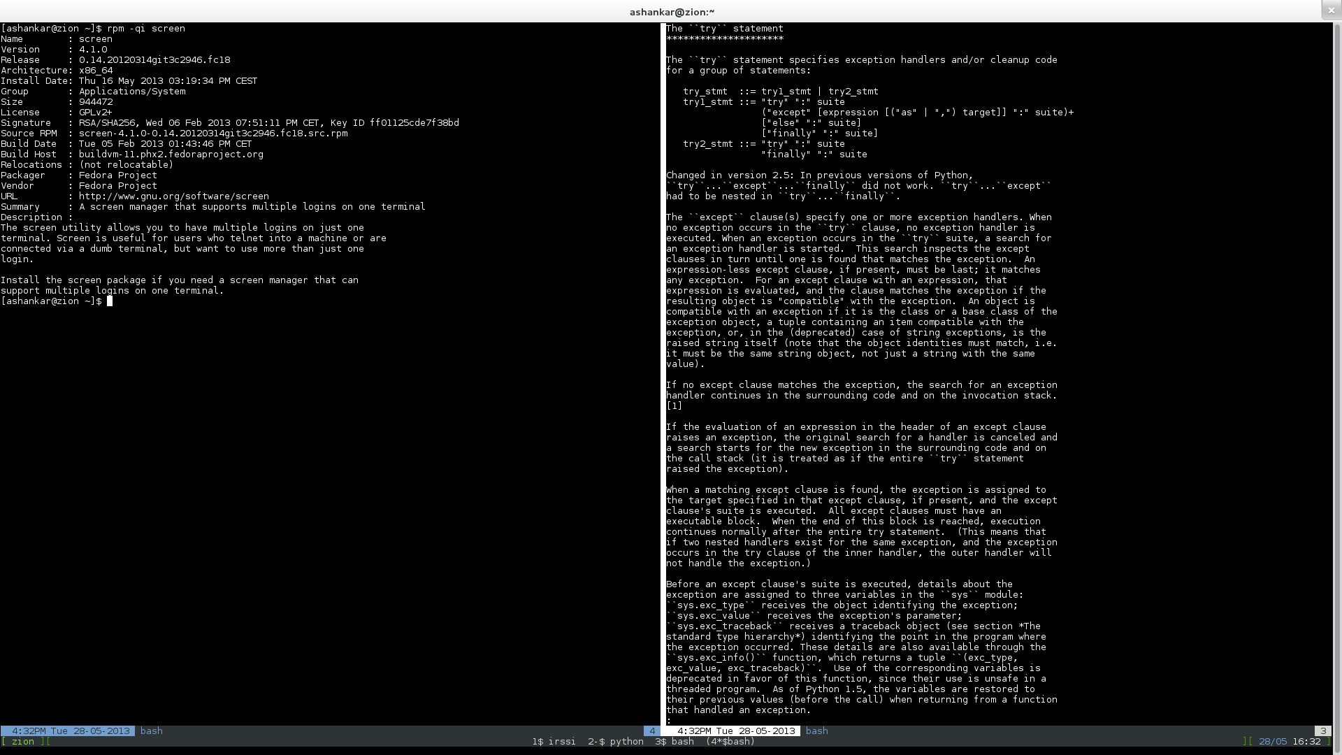
Interface 2: Disable filesystem, all network information (right panel), keyboard (may be configurable), manufacturer/model/chassis, memory and top processes. Then, Date/hour/uptime and a minimized cpu usage would go on a bottom panel on a single line (like Gnu Screen is often tuned into). See below for a GNU Screen example.
Interface 3: Wide screen for terminal without distraction.
What do you think? Don't you think this could make eDEX-ui more usable on a daily basis?
Thanks!
This discussion was converted from issue #894 on December 13, 2020 13:38.
Heading
Bold
Italic
Quote
Code
Link
Numbered list
Unordered list
Task list
Attach files
Mention
Reference
Menu
reacted with thumbs up emoji reacted with thumbs down emoji reacted with laugh emoji reacted with hooray emoji reacted with confused emoji reacted with heart emoji reacted with rocket emoji reacted with eyes emoji
-
Hello,
Sometimes you need more space on your terminal. IMHO eDEX-ui would be more usable if we could toggle several interfaces. For instance,
CTRL-SHIFT-J(orCTRL-SHIFT-Tas I am on abépokeyboard) would toggle interface 1, then 2, then 3.What do you think? Don't you think this could make eDEX-ui more usable on a daily basis?
Thanks!
GNU Screen example:

Beta Was this translation helpful? Give feedback.
All reactions