This is a Grafana datasource for showing metrics from Instana AI-Powered APM for dynamic applications.
Attention: Grafana 7.0.0+ is required.
For On-premise customers Instana Release 146 is required.
- Dynamic Focus queries
- Applications and Websites
- Automatic completion for available types and metrics
- Utilizes Instana REST API
- Security via access token
This datasource uses the Instana REST API to query the metric values. First of all you will need to generate an API token. Use this token along with the URL for your Instana account e.g. https://prod-acme.instana.io
To use the Grafana server as a proxy for querying Instana REST API please check Use proxy.
To enable metrics for offline snapshots please check Enable offline snapshots. For On-premise customers Instana Release 156 is required.
The configuration allows the setting of a limit for the different categories that this plugin offers. Numeric values can be entered in order to make sure that queries do not exceed a certain amount of window size that they query. This can be useful when experiencing Grafana performance issues. See the gif below on how this limit exactly works.
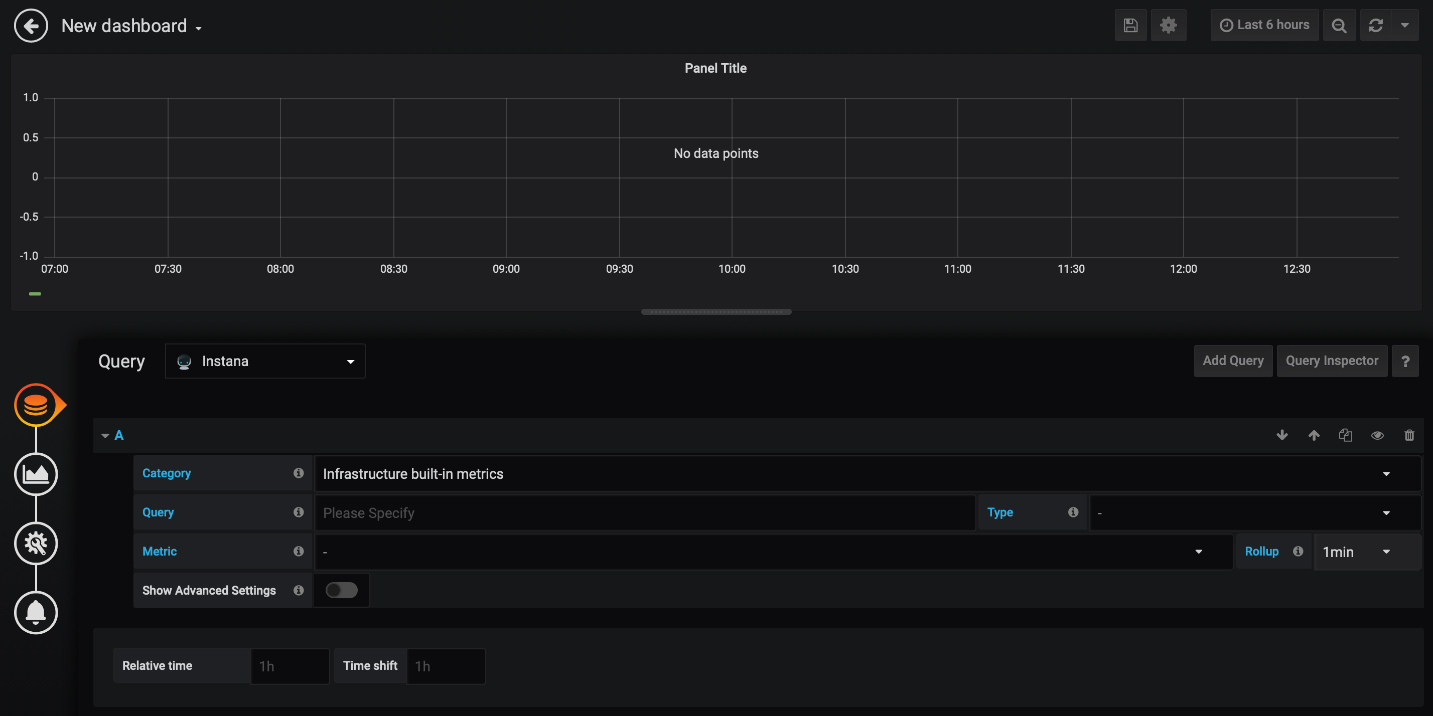
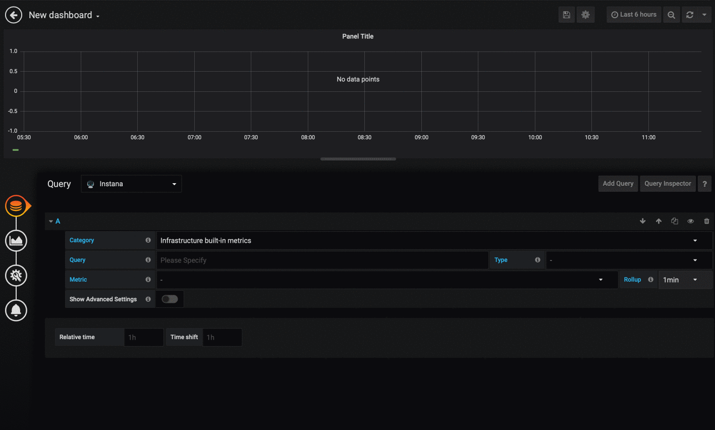
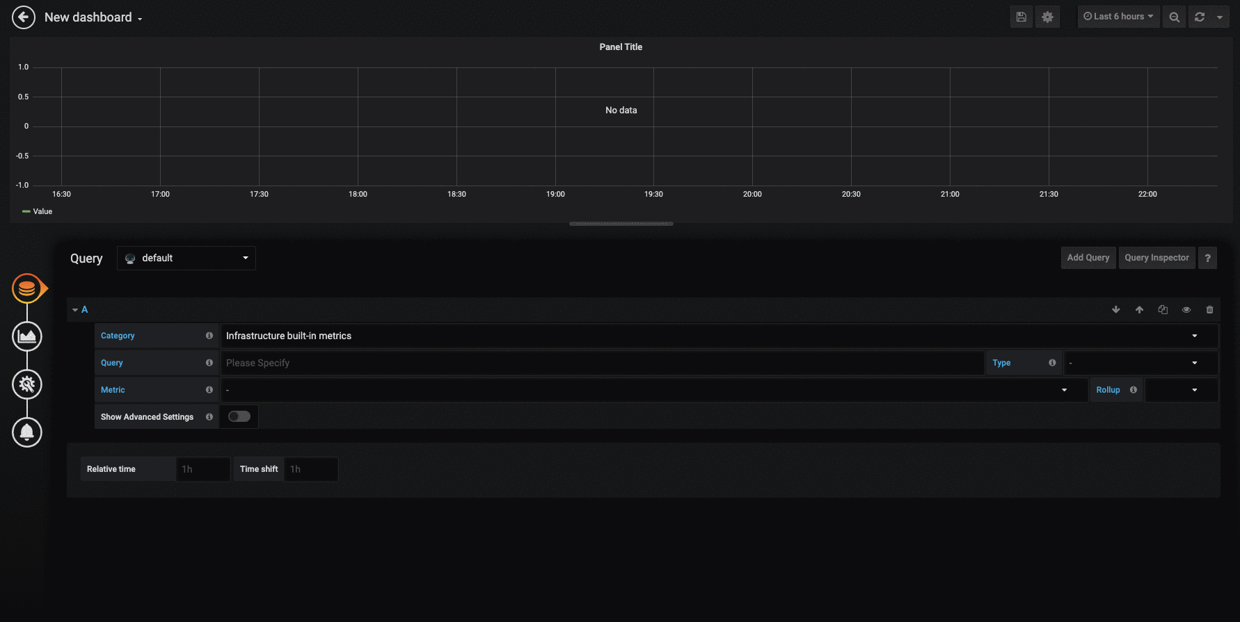
To start, enter the Dynamic Focus query. This is exactly the same as used in the Instana dashboard; you can test your queries in Instana and then copy and paste them into Grafana. NOTE Saved filters are not currently supported by the Grafana datasource plugin.
Once you filled in the query the available types dropdown will be automatically populated, select the type you want.
As you select the type, the available metrics dropdown will be automatically populated, select the metric you want.
If your Dynamic Focus query matches multiple instances then, the returned dataset will include metrics from all those matching instances, providing graphs with multiple plots like the example below.

To choose custom metrics matching your query you need to select "Infrastructure custom metrics" from the category dropdown, which will automatically populate the available types dropdown.
As you select the type, the available metrics dropdown will be automatically populated, select the metric you want. As there might be a huge amount of custom metrics, you can specify an optional filter to reduce to a corresponding subset.
If your Dynamic Focus query matches, the returned dataset will include metrics providing graphs like the example below.
To adjust the legend display you can provide an own "Legend format". Supported values for replacement are:
- $label - the entity label
- $host - the corresponding host
- $pid - the corresponding PID
- $timeShift - corresponding timeShift
- $metric - the displayed metric
- $type - the entity type
- $service - the service label (for endpoints only)
- $name - a label alternative
- $index - index in the list
A simple version of getting metrics related to one or multiple applications. Once an application and a metric are selected, the graphs will be drawn (see example below).
To adjust the legend display you can provide an own "Legend format". Supported values for replacement are:
- $label - the entity label
- $application - application label
- $timeShift - corresponding timeShift
- $metric - the displayed metric
- $key - metric key with aggregation and rollup
- $index - index in the list
If no custom format is provided the default label '$label ($application) $metric' will be shown.
Allows to show metrics related to a service. Services can either be selected as standalone (first gif) or in combination with an Application Perspective (second gif) to show more detailed metric data. As soon as an application is selected the dropdown menu of possible services reloads and only shows services that are actually being used by the selected application.
To adjust the legend display you can provide an own "Legend format". Supported values for replacement are:
- $label - the entity label
- $service - service label
- $application - application label (if selected)
- $timeShift - corresponding timeShift
- $metric - the displayed metric
- $key - metric key with aggregation and rollup
- $index - index in the list
If no custom format is provided the default label '$label ($service) $metric' will be shown.
Allows to show metrics related to an endpoint. Endpoints can either be selected as standalone or in combination with an Application Perspective and service to show more detailed metric data. Since multiple endpoints can have the same name, it is recommended to select an application, then a service, and finally an endpoint in order to be sure to select the correct endpoint. Possible selectable items are reloaded and cached each time a service and an application is changed.

To adjust the legend display you can provide an own "Legend format". Supported values for replacement are:
- $label - the entity label
- $application - application label (if selected)
- $service - service label (if selected)
- $endpoint - endpoint label
- $timeShift - corresponding timeShift
- $metric - the displayed metric
- $key - metric key with aggregation and rollup
- $index - index in the list
If no custom format is provided the default label '$label ($endpoint) $metric' will be shown.
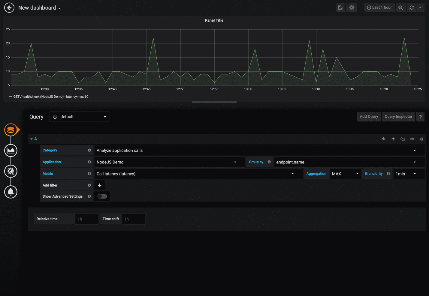
To choose application metrics you need to select "Analyze application calls" from the category dropdown. This will populate the other dropdown lists.
The "Application" dropdown will contain a list of all applications sorted by their name.
Most metrics will have more than one aggregation type (SUM, MEAN, ...) and you can choose which one to use.
It's also possible to add additional filters via "add Filter". Multiple filters are concatenated using "AND".
If your selection matches, the returned dataset will include metrics providing graphs like the example below.
If more then 20 metics are fetched, a warning appears that not all results are shown. Add Filter to narrow down the data.
To adjust the legend display you can provide an own "Legend format". Supported values for replacement are:
- $label - the entity label
- $application - application label
- $timeShift - corresponding timeShift
- $metric - the displayed metric
- $key - metric key with aggregation and rollup
- $index - index in the list
If no custom format is provided the default label '$label ($application) $metric' will be shown.
To choose EUM website metrics you need to select "Analyze websites" from the category dropdown. This will populate the other dropdown lists.
The "Website" dropdown will contain a list of all websites sorted by their pageloads.
Most metrics will have more than one aggregation type (SUM, MEAN, ...) and you can choose which one to use.
It's also possible to add additional filters via "add Filter". Multiple filters are concatenated using "AND".
If your selection matches, the returned dataset will include metrics providing graphs like the example below.

A default label '$label ($website) $metric' will be shown.
To adjust the legend display you can provide an own "Legend format". Supported values for replacement are:
- $label - the entity label
- $website - website label
- $type - entity type
- $timeShift - corresponding timeShift
- $metric - the displayed metric
- $key - metric key with aggregation and rollup
- $index - index in the list
If no custom format is provided the default label '$label ($website) $metric' will be shown.
Display specific SLO/SLI information in Grafana based on Instana. This category can be enabled by going into the Instana Grafana plugin's settings and enable the Enable SLO Dashboards toggle. Then, the category will be visible next to the others.
For SLI: Use the Gauge visualization to display the SLI. Move to the Threshold settings and switch the colors (red to green, green to red). Type in your SLO in order to properly show the SLO threshold. Further, choose "percent" as your unit (Field settings).
For Remaining Error Budget:
Use the Singlestat visualization. Move to Coloring settings, toggle the Background toggle and use 0,0 as your Thresholds. Also, invert the colors below. This will turn the background of the panel green as long as the number of remaining minutes is positive.
For Timeseries:
Select graph visualization, choose bars instead of lines as your draw mode and add a Y-Max value of 1 for the left y axis.
The image below shows how such a dashboard could look like.

While using the "Singlestat" visualization an additional metric aggregation is selectable. For showing a correct SUM metric, configuration on two different places is needed:
- on metric selection: "SUM" to adjust our mean calculated rollup values
- on Singlestat configuation: "Total" to tell the panel to aggregate all given values

While using the "Table" visualization an additional metric aggregation is selectable.

The time shift option allows going back in different points of time for each query.
This new feature can be used to compare two identical queries while one shows the query's outcome of a day earlier.
This plugin also supports the ability to select different granularity values to provide a even deeper look into metrics.

Aggregate graphs on query level and choose to show everything or only the aggregated graph.
