Replies: 15 comments 1 reply
-
|
I see your point. I'll have to agree that the button styling is rather opinionated, it has grown from a project of ours where the design system assumed buttons to be as round as they are. The I recently came across the Fluent UI's Compound Button and fell in love. I think I want the That said, we are open to altering the Button component's philisophy, but we'd rather have it incremental, in patches of non-breaking changes, where possible. That's why I don't think that setting the default button radius to 0 is a good idea. I remember you pointing out in another issue that a border radius this large looks bad, but this ultimately comes down to preference. As for the button sizes, I see a lot of UI libraries do that, but struggle to find a usecase for anything other than regular and small. Maybe you could pitch this idea to us? :) Here's a plan the way I see it:
What do you think of it? @aabounegm would also want to hear your opinion on this |
Beta Was this translation helpful? Give feedback.
-
|
Personally, I agree that we still need more SASS variables for per-component customization. I like the way Vuetify achieves it by having some global variables, with more variables for each component defaulting to the global one. Take the About the buttons in particular, I also agree that Also, I generally prefer using props rather than SASS variables when it comes to customizing buttons, but that depends on how radical that customization is (for example, I'd choose a SASS variable for changing the background color of all buttons slightly, but a prop for making them round), but that's just me (and might be because of my previous experience with Vuetify buttons). Coming back to the main point, I would prefer if the default buttons were rectangular, needing to pass the To sum up, here is what I think of the proposed plan:
|

Beta Was this translation helpful? Give feedback.
-
|
I also don't like the idea of a separate component for rectangular buttons. That feels over-engineered to me. I've worked with many UI frameworks and the best one's have a single, flexible button component. Quasar gets it right imho (but they are VueJS-based): https://quasar.dev/vue-components/button. Two components mean they will diverge and ultimately that will cause more problems than it solves. I don't like the fluent button you linked at all. It's ugly for a start and I think button groups (alla mobile design) are a much better term and concept than I'm in agreement with @aabounegm mostly except for the bit about rugby balls. I think you have to make a distinction between Maybe |
Beta Was this translation helpful? Give feedback.
-
|
wrt sizing... you may not need additional sizes but more options = more use cases = more users, within reasonable limits... and most CSS users are used to the idea of those 5 categories: xs, sm, md ,lg, xl. They are used for breakpoints, and elsewhere. People are used to that as a standard. So it's a good one to adopt. Regular and small is probably enough for most people but maybe you're building a site where you want people to be able to adjust button sizes... e.g. touchscreen... you want two large call to action buttons. Or maybe you're building a fiddly Desktop interface where you really need lots of really small buttons to fit everything in. |
Beta Was this translation helpful? Give feedback.
-
But why would you need a circular button other than for an icon (for which we agreed there would be an |
Beta Was this translation helpful? Give feedback.
-
|
You might be designing a layout with big round buttons that have text in them. Why limit the creative choices? Maybe you put an image background inside instead of an icon. Round tells you the shape (which is what you care about when you're designing) not the purpose (which may not be the same for every site). Also why introduce a breaking change to change a term that's perfectly good as it stands? |
Beta Was this translation helpful? Give feedback.
-
|
Maybe I'm not understanding the intended difference between It's semantics at the end of the day. The word |
Beta Was this translation helpful? Give feedback.
-
|
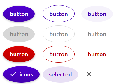
Ok, to make my intentions absolutely clear, here is what I propose (most screenshots taken from Vuetify): As for the sizing, I agree that having |


Beta Was this translation helpful? Give feedback.
-
|
Ok but what's the difference between |
Beta Was this translation helpful? Give feedback.
-
|
I think you both got me wrong on the rectangular button component. Let me restate that Notice the size difference. This distinction makes it very clear for the user that these aren't regular buttons: these are prominent actions that a user can take, while usual buttons are more contextual, local actions. That's why I like the Fluent's Compound Buttons – because they supercharge this idea of menu-creating buttons by giving them additional information, such as a textual description of an action. You wouldn't want this additional text on a regular button: That's why I think that rectangular buttons deserve their own component. Of course, the current naming is unfortunate, as it doesn't convey the semantic difference between the two types of buttons and misleads users into thinking that |


Beta Was this translation helpful? Give feedback.
-
Okay, this might sound like I'm contradicting myself. I suppose I just changed my mind over this discussion.
Now let me elaborate on these. 1. Such a change is breaking, but what good does it do to the library users? They can still change the button radius with a Sass variable to their liking, so we're not giving them extra freedom with this change. "It looks better" is subjective, and above all, I really don't want Attractions to become 2. I believe that an interface with both rectangular and round buttons is questionable. What makes these buttons so different? In Material, there is a Floating Action Button – something fundamentally different from regular buttons, which justifies the use of rounding. However, we don't provide FABs in this library (and don't plan to), and I can't, off the top of my head, come up with other use-cases of round icon buttons in a mostly-rectangular-buttons setting. Making it easy for rookie designers to introduce such inconsistencies into their designs is not a good idea, in my opinion. That said, my current position on the |

Beta Was this translation helpful? Give feedback.
-
|
@aabounegm by "horizontal increment" I mean the difference between horizontal and vertical padding. It's a good idea to have horizontal padding be larger than the vertical padding for textual buttons, however, some users may want to customize that difference: |

Beta Was this translation helpful? Give feedback.
-
Well, I cannot fully agree with that. More options = more time to choose + more chance of making a mistake for a rookie designer. People are used to that as a standard, but that's not what makes a standard good. These sizes are used for breakpoints, but the sizes of buttons shouldn't correspond to these breakpoints, i.e., a button on a mobile device shouldn't be |
Beta Was this translation helpful? Give feedback.
-
I guess you are right. In that case, it can either be just one prop (say,
Ok, they aren't regular buttons, but they are still buttons, right? Where do you draw the line between if something is a button or a "special button" that needs its own component? Is a FAB still a button or would it need a separate component? The distinction can be made clear using prop names (like
Well, styles and semantics go hand in hand, right? For different semantics you use different styles, and using different styles you convey different semantics. We give people various ways of changing the styles while making clear the intended us of these styles (using prop names or docs or so), and they are responsible for using them in the manner which was intended or in their own way. We shouldn't limit people's creativity because some things just aren't set in stone (for example, you said the large button is mainly used for menus, but your own screenshot says otherwise; if we can break the "rules", why can't others?)
I disagree here. Giving a different default look doesn't count as a breaking change, imo. It is very easily noticeable and requires minimal, depending on how many users changed the default
Well, that's your personal (respected) opinion, but others may have different use cases. You said yourself that we don't provide a FAB component, so people could use round buttons as FABs if they need to.
True, but why leave the experience designer out? I believe that having more options (and hence finer control) is always better as long as the defaults provide me with something working and I don't always have to manually tweak each usage of the component. Lastly, having one component with many different possible shapes might seem inconsistent or unnecessary to you, but I personally feel more comfortable having to remember (and import) just one component and control its style everywhere I need (as is the case with |
Beta Was this translation helpful? Give feedback.
-
|
Interesting discussion on how opinionated vs configurable to make a component library. Isn't there a difference in this regard between a component library for a particular client or organization, where it is important that design tokens are consistent across products, to a library which wants to be adapted for any developers needs? I feel in many ways Attractions feels more like the latter right now--something made for a client (which is not a bad thing). I would be happy to see it veer to a more community project with more stress on developer experience, but that is up to you guys. There is certainly need for more Svelte component lib alternatives if you want to make that effort. |
Beta Was this translation helpful? Give feedback.
-
|
I understand what you are saying, and you have it correct. This library emerged from another project that was a website for our university, which is why it feels opinionated and trying to be consistent. However, we are constantly trying to become more open and cater to more needs, which is why we always appreciate feedback and contribution. That being said, we also try to never compromise in terms of quality, which (aside from being subjective) can sometimes make for a tough tradeoff between convenience and code quality. |
Beta Was this translation helpful? Give feedback.
-
Firstly I love Attractions. I've selected it for use.
One thing that seems completely wrong to me though is the approach to button radius. The way it works is just counter-intuitive and frankly, unusable.
Problems:
rectangleprop has been used where it divides the $border-radius var means that if you want square buttons mostly, you can no longer have round buttons. In other words; if you change $border-radius to make square-corner buttons,roundno longer works and you cannot have any round buttons. You really want the flexibility to have both.Solution:
rectangleshould not adjust $border-radiussizerather thansmall, then we have have 5 different sizes: xs, sm, md (default), lg, xl.roundshould adjust border radius, not by a factor but rather by a hard-coded value proportional to thesizeprop, or a calculated value proportional to height, and should always render a completely round button.Beta Was this translation helpful? Give feedback.
All reactions