| description |
|---|
GF Flutter appbar is a top action bar or a top action button that has a dedicated space with visual structure and interactive elements. |
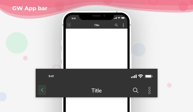
Flutter Appbar is an action button that is placed on the top of the screen and is a static one. It basically consists of a toolbar and other widgets that can also be used inside the Flutter Appbar.
GFAppBar is a Flutter Appbar that consists of a leading button and the actions button in the appbar which will be fixed on the top. Flutter Appbar provides flexible space for any widgets.
Flutter SliverAppbar is a Flutter Appbar that provides a certain height for the appbar which will be scrollable and after some extend of scrolling the appbar will be a fixed one at the top like a normal appbar.
A GFAppBar is a Flutter AppBar widget that consists of a toolbar and potentially other widgets, such as a GFTabBar and FlexibleSpaceBar. The GFAppBar displays the toolbar widgets, leading, title, and actions.
GFAppbar has a menu icon button or flutter appbar icon on the top left corner that can be changed according to the need. The leading appbar button parameter is used to change the default menu icon button.
The below example code shows a simple appbar ****with a flutter appbar back button on the **leading parameter** which is used to go back to the previous page.
import 'package:getwidget/getwidget.dart';
GFAppBar(
leading: GFIconButton(
icon: Icon(
Icons.message,
color: Colors.white,
),
onPressed: () {},
type: GFButtonType.transparent,
),
title: Text("GF Appbar"),
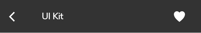
actions: <Widget>[
GFIconButton(
icon: Icon(
Icons.favorite,
color: Colors.white,
),
onPressed: () {},
type: GFButtonType.transparent,
),
],
),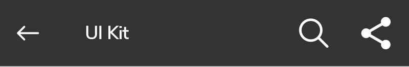
GFAppbar has a parameter calledsearchBarwherein it is a boolean variable. If the searchBar is given the valuetruethen it displays a search bar textfield in the title space of the appbar with leading, trailing options.
The below example demo code shows the example of how to pass the parameter.
import 'package:getwidget/getwidget.dart';

GFAppBar(
  leading:  GFIconButton(
    icon: Icon(
      Icons.message,
      color: Colors.white,
    ),
    onPressed: () {},
    type: GFButtonType.transparent,
  ),
  searchBar: true,
  title: Text("GF Appbar"),
  actions: <Widget>[
    GFIconButton(
      icon: Icon(
        Icons.favorite,
        color: Colors.white,
      ),
      onPressed: () {},
      type: GFButtonType.transparent,
    ),
  ],
),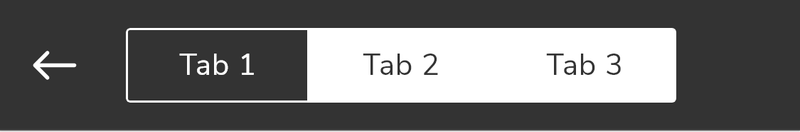
Segmented tabs can also be used inside the GFAppbar. In the title field of the Appbar just define the Segmented tab code and the work will be done.
The example below code shows a simple segmented tab inside Appbar.
import 'package:getwidget/getwidget.dart';

TabController tabController;
  @override
  void initState() {
    super.initState();
    tabController = TabController(length: 3, vsync: this);
  }

  @override
  void dispose() {
    tabController.dispose();
    super.dispose();
  }

  return Scaffold(
      appBar: GFAppBar(
        backgroundColor: GFColors.getGFColor(GFColor.dark),
        title:   GFSegmentTabs(
          tabController: tabController,
          tabBarColor: GFColors.getGFColor(GFColor.light),
          labelColor: GFColors.getGFColor(GFColor.white),
          unselectedLabelColor: GFColors.getGFColor(GFColor.dark),
          indicator: BoxDecoration(
            color: GFColors.getGFColor(GFColor.dark),
          ),
          indicatorPadding: EdgeInsets.all(8.0),
          indicatorWeight: 2.0,
          border: Border.all(color: Colors.white, width: 1.0),
             length: 3,
              tabs: <Widget>[
                Text(
                  "Tab1",
                ),
                Text(
                  "Tab2",
                ),
                Text(
                  "Tab3",
                ),
              ],
            ),
          ),
 body: GFTabBarView(controller: tabController, children: <Widget>[
   Center(
     child: Text('Tab 1'),
   ),
   Center(
     child: Text('Tab 2'),
   ),
   Center(
     child: Text('Tab 3'),
   ),
 ]),
);The look and feel of the GFAppbar search bar can be customized using the GFAppbar properties.
| Name | Description |
|---|---|
| searchBar | If true, displays search bar in the title space |
| searchHintText | It takes the text to displays the search bar hint text |
| searchHintStyle | It styles the [searchHintText] |
| searchTextStyle | It styles the search text |
| searchBarColorTheme | It defines the search bar icons color theme |
| searchController | Controls the text being edited. If null, this widget will create its own [TextEditingController] |
| onChanged | Called when the user initiates a change to the TextField's value: when they have inserted or deleted text |
| onSubmitted | Called when the user indicates that they are done editing the text in the field. |
| onTap | Called for each distinct tap except for every second tap of a double tap. If the text field is created with enabled false, taps will not be recognized. |
Look and feel of the GFAppbar can be customized using the GFAppbar properties.
| Name | Description |
|---|---|
| leading | A widget to display before the [title] |
| automaticallyImplyLeading | Controls whether we should try to imply the leading widget if null. If true and [leading] is null, automatically try to deduce what the leading widget should be. If false and [leading] is null, leading space is given to [title]. If leading widget is not null, this parameter has no effect. |
| title | The primary widget displayed in the app bar. Typically a [Text] widget containing a description of the current contents of the app. |
| actions | Widgets to display after the [title] widget. Typically these widgets are [IconButton]s representing common operations. For less common operations, consider using a [PopupMenuButton] as the last action. |
| flexibleSpace | This widget is stacked behind the toolbar and the tab bar. It's height will be the same as the app bar's overall height. |
| bottom | This widget appears across the bottom of the app bar. Typically a [TabBar]. Only widgets that implement [PreferredSizeWidget] can be used at the bottom of an app bar. |
| elevation | The z-coordinate at which to place this app bar relative to its parent. This controls the size of the shadow below the app bar. The value is non-negative. |
| shape | The material's shape as well its shadow. A shadow is only displayed if the [elevation] is greater than zero. |
| backgroundColor | The color to change background color of the app bar's material. |
| brightness | The brightness of the app bar's material. Typically this is set along with [backgroundColor], [iconTheme], [textTheme]. |
| iconTheme | The color, opacity, and size to use for app bar icons. Typically this is set along with [backgroundColor], [brightness], [textTheme]. |
| actionsIconTheme | The color, opacity, and size to use for the icons that appear in the appbar's [actions]. This should only be used when the [actions] should be themed differently than the icon that appears in the app bar's [leading] widget. |
| textTheme | The typographic styles to use for text in the app bar. Typically this is set along with [brightness] [backgroundColor], [iconTheme]. |
| primary | Whether this app bar is being displayed at the top of the screen. If true, the app bar's toolbar elements and [bottom] widget will be padded on top by the height of the system status bar. The layout of the [flexibleSpace] is not affected by the [primary] property. |
| centerTitle | Whether the title should be centered. Defaults to being adapted to the current [TargetPlatform]. |
| titleSpacing | The spacing around [title] content on the horizontal axis. This spacing is applied even if there is no [leading] content or [actions]. If you want [title] to take all the space available, set this value to 0.0. |
| toolbarOpacity | How opaque the toolbar part of the app bar is. A value of 1.0 is fully opaque, and a value of 0.0 is fully transparent. |
| bottomOpacity | How opaque the bottom part of the app bar is. A value of 1.0 is fully opaque, and a value of 0.0 is fully transparent. |
| preferredSize | A size whose height is the sum of [kToolbarHeight] and the [bottom] widget's preferred height. [Scaffold] uses this size to set its app bar's height. |
| searchBar | If true, displays search bar in the title space |