| description |
|---|
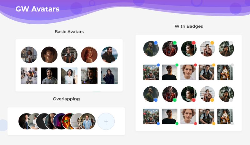
GF Flutter Avatar Widgets come with lots of custom properties like Square, Circle shape and also can use with Badge or other GF widgets. |
GFAvatar is a Flutter Avatar which is an image basically used to display the user picture in the profile section. GFAvatar has different shapes wherein the popular is a Circular Avatar.
The Flutter Circle Avatar widget has a circle shape image**. GFAvatar** comes with different shapes, in which one of the default shapes is a circle. To place the image inside the GFAvatar, the image should be given inbackgroundImageproperty. The below code shows a simple Circle Avatar.
import 'package:getwidget/getwidget.dart';

GFAvatar(
  backgroundImage:NetworkImage(AvatarUrl),
)GFAvatar has another type of avatar called Standard Avatar. It is a Square shape avatar with slightly rounded corners as shown in the below image. The code below gives a Standard Square Avatar.

import 'package:getwidget/getwidget.dart';

GFAvatar(
  backgroundImage:NetworkImage(AvatarUrl),
  shape: GFAvatarShape.standard
)GFAvatar has another type of avatar called Square Avatar. It is a Square shape avatar with no rounded corners as shown in the below image. The code below gives a Standard Avatar.

import 'package:getwidget/getwidget.dart';

GFAvatar(
  backgroundImage:NetworkImage(AvatarUrl),
  shape: GFAvatarShape.square
)The look and feel of GFAvatar can be customized using the following properties:
| Name | Description |
|---|---|
| child | type of [Widget], which can have text, icon, etc |
| backgroundColor | GFColor or Color to fill the background of the avatar |
| foregroundColor | GFColor or Color to change the textColor inside the avatar |
| radius | size of the avatar |
| minRadius | minimum size of the avatar |
| maxRadius | maximum size of the avatar |
| size | size of the avatar i.e GFSize.large, GFSize.medium, GFSize.small |
| shape | shape of the avatar i.e, GFAvatarShape.standard, GFAvatarShape.circle, GFAvatarShape.square |
| borderRadius | extra radius to avatar shapes, not applicable to the circular avatar |