| description |
|---|
Flutter Badge is a notification alarm that gives some additional information about the widget. |
GFBadges are the Flutter Badges that are used to alert notification in the active widget. It gives the number of active notifications that arose.
Typically GFBadge takes text widget as a child, to display the number or characters inside badges.
import 'package:getwidget/getwidget.dart';

GFBadge(
  onPressed: (){},
  child: Text("12"),
),GFBadge size can be varied using the size property, which specifies the size of the badge. Default badge size set to GFSize.medium.
import 'package:getwidget/getwidget.dart';

GFBadge(
    onPressed: (){},
    child: "primary",
    size: GFSize.small,
),the Shape of GFBadge can be changed by setting property shape to GFIconButtonShape.circle. Default shape of the Badge set toGFIconButtonShape.standardwhich gives square-shaped IconButton with slightly rounded corners.
import 'package:getwidget/getwidget.dart';

GFBadge(
    onPressed: (){},
    child: "primary",
    shape: GFIconButtonShape.pills,
),| Name | Description |
|---|---|
| Description | The GFBadge Shape |
| Attribute | shape |
| Type | GFBadgeShape.standard, GFBadgeShape.square, GFBadgeShape.pills, GFBadgeShape.circle |
| Default | GFButtonShape.standard |
| Name | Description |
|---|---|
| child | child of type [widget] alternative to text |
| textcolor | the color to use for this badge;s text |
| textStyle | defines the styling of the text |
| border | defines the border side |
| bordershape | defines the shape of the border |
| color | GFColor is used to change the background of the button. |
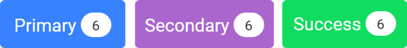
GFBadges can be used with buttons to display the number of notifications the active widget has. Below is the code for the button with GFBadge.
import 'package:getwidget/getwidget.dart';

GFButtonBadge(
  onPressed: () {},
  text: 'primary',
  icon: GFBadge(
    child: Text("12"),
  ),
),
Default button shape set toGFButtonShape.standardso that we will get standard-shaped button with solid background color and slightly rounded corners.
By default, button type is set toGFType.solidso, we will get buttons that have a solid background color with slightly rounded corners.
The callback is called when the button is tapped. By adding a callback to onPressed enables the button.
import 'package:getwidget/getwidget.dart';

GFButtonBadge(
  onPressed: (){},
  text: "primary",
  icon: GFBadge(
    child: Text("12"),
  ),
),
If this callback and onPressed are null, then the button will be disabled. Default GFButton will be disabled because onPressed will be set to null.
import 'package:getwidget/getwidget.dart';

GFButtonBadge(
    onPressed: null,
    text: "primary",
    icon: GFBadge(
       child: Text("12"),
     ),
 ),
Flutter Outline Button describes the button with a transparent background and a visible border. This button can be easily found in GFButton by adding type as GFType.outline.
import 'package:getwidget/getwidget.dart';

GFButtonBadge(
    onPressed: (){},
    text: "primary",
    icon: GFBadge(
      child: Text("12"),
    ),
    type: GFType.outline,
 ),
Flutter Pills Badge can be achieved by adding property shape as GFButtonShape.pills.
import 'package:getwidget/getwidget.dart';

  GFButtonBadge(
    onPressed: (){},
    text: "primary",
    icon: GFBadge(
      child: Text("12"),
    ),
    shape: GFButtonShape.pills,
),GFButton size can be varied using size property, which specifies the size of the button. Default button size set to GFSize.medium.
import 'package:getwidget/getwidget.dart';

GFButtonBadge(
    onPressed: (){},
    text: "primary",
    icon: GFBadge(
      child: Text("12"),
    ),
    size: GFSize.small,
 ),
GF Button Badge can be styled with several attributes to look a specific way. Each and every attribute is described below.
GFColor is used to change the background of the button.
| Name | Description |
|---|---|
| Description | The color to use from application's color pallete |
| Attribute | color |
| Type | GFColor |
| Default | GFColor.primary |
GFSize property is used to change the size of GFBadge
| Name | Description |
|---|---|
| Description | The GFButtonBadge Size |
| Attribute | size |
| Type | GFSize.large, GFSize.medium, GfSize.small |
| Default | GFSize.medium |
GFBadge shape can be changed using the shape parameter as shown below
| Name | Description |
|---|---|
| Description | The GFButtonBadge Shape |
| Attribute | shape |
| Type | GFButtonShape.standard, GFButtonShape.square, GFButtonShape.pills |
| Default | GFButtonShape.standard |
GFBadge type can be changed using the type parameter as shown below
| Name | Description |
|---|---|
| Description | The GFButtonBadge Type |
| Attribute | type |
| Type | GFType.solid, GFType.outline, GFType.outline2x, GFType.transparent |
| Default | GFType.solid |
GFBadge position can be changed using the position parameter as shown below
| Name | Description |
|---|---|
| Description | The GFButtonBadge Position |
| Attribute | position |
| Type | GFPosition.start, GFPosition.end |
| Default | GFPosition.start |
| Name | Description |
|---|---|
| onPressed | callback i.e, called when the button is tapped |
| onLongPressed | callback i.e, called when the button is long-pressed |
| text | text of type [string] to describe button's label. text will be priority over child |
| icon | icon of type [widget] to describe button's label with icon |
| child | child of type [widget] alternative to text |
| textcolor | the color to use for this button's text when the button is enabled |
| textStyle | defines the styling of the text |
| disabledColor | the fillcolor of the button when the button is disabled |
| disabledTextColor | the color to use for this button's text when the button is disabled |
| borderSide | defines the border side |
| bordershape | defines the shape of the border |
| buttonBoxShadow | if true, default boxShadow appears around button. |
| boxShadow | defines the boxShadow |
| fullWidthButton | if true, defines the full width of the button. |
| blockButton | if true, defines the block button. |
| padding | defines internal padding of the button |
| focusColor | fillColor of the button when it has the input focused |
| hoverColor | fillColor of the button when the pointer is hovered over it |
| splashColor | indicates that the button has been touched |
| highlightColor | indicates that the button is actively being pressed |
GFBadges can be used with Buttons to display the notifications with icons using GFIconBadge button as shown in the below example.
import 'package:getwidget/getwidget.dart';

GFIconBadge(
  child: GFIconButton(
   onPressed: (){},
   icon: Icon(Icons.ac_unit),
  ),
  counterChild: GFBadge(
    child: Text("12"),
  ),
),
Default icon button shape is set to GFButtonShape.standard so that we will able to get standard shaped button with solid background color with slightly rounded corners.
GFButton size can be varied using size property, which specifies the size of the button. Default button size set to GFSize.medium.
import 'package:getwidget/getwidget.dart';

GFIconBadge(
  child: GFIconButton(
   onPressed: (){},
   icon: Icon(Icons.ac_unit),
   size: GFSize.large,
  ),
  counterChild: GFBadge(
    child: Text("12"),
  ),
),GFButton type can be changed using property type by setting to GFType.outline. Default type of the IconButton will be GFType.solid.
import 'package:getwidget/getwidget.dart';

 GFIconBadge(
  child: GFIconButton(
   onPressed: (){},
   icon: Icon(Icons.ac_unit),
   type: GFType.outline,
  ),
  counterChild: GFBadge(
    child: Text("12"),
  ),
),The Shape of Icon Button can be changed by setting property shape to GFIconButtonShape.circle. Default shape of the IconButton set to GFIconButtonShape.standard which gives square shaped IconButton with slightly rounded corners.
import 'package:getwidget/getwidget.dart';

GFIconBadge(
  child: GFIconButton(
   onPressed: (){},
   icon: Icon(Icons.ac_unit),
   shape: GFIconButtonShape.pills,
  ),
  counterChild: GFBadge(
    child: Text("12"),
  ),
),| Name | Description |
|---|---|
| Description | The GFIconButton Shape |
| Attribute | shape |
| Type | GFIconButtonShape.standard, GFIconButtonShape.square, GFIconButtonShape.pills, GFIconButtonShape.circle |
| Default | GFIconButtonShape.standard |
| Name | Description |
|---|---|
| child | child of type [widget] alternative to text |
| textcolor | the color to use for this badge;s text |
| textStyle | defines the styling of the text |
| borderSide | defines the border side |
| bordershape | defines the shape of the border |
| color | GFColor is used to change the background of the button. |
| iconSize | defines the size of icon |
| buttonBoxShadow | if true, default boxShadow appears around button. |
| boxShadow | defines the boxShadow |