| description |
|---|
GF Flutter Square Button Widget looks like a solid button without rounded corners. It comes with 100 + custom properties to customize button size, color, width, and many more. |
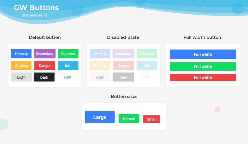
GFButtons are clickable buttons that are used widely in an application. GFButtons come in many shapes and one of the shapes is a square-shaped button.
We will be able to get a flutter square-shaped button with solid background color with no rounded corners by adding property shape with GFButtonShape.square .
import 'package:getwidget/getwidget.dart';

GFButton(
    onPressed: (){},
    text: "primary",
    shape: GFButtonShape.square,
  ),
By default, the button type is set to GFButtonType.solid so, we were able to get a square-shaped button that has a solid background color with no rounded corners.
The callback is called when the button is tapped. By adding a callback to onPressed enables the button.
import 'package:getwidget/getwidget.dart';

  GFButton(
    onPressed: (){},
    text: "primary",
    shape: GFButtonShape.square,
  ),
If this callback and onPressed are null, then the button will be disabled. Default GFButton will be disabled as onPressed is set to null.
import 'package:getwidget/getwidget.dart';

GFButton(
    onPressed: null,
    text: "primary",
    shape: GFButtonShape.square,
 ),
The Flutter Block button specifies how wide the button should be. By setting blockButton state,true it will change the button to a full-width block with no rounded corners. Default blockButton is set to false.
import 'package:getwidget/getwidget.dart';

GFButton(
    onPressed: (){},
    text: "primary",
    shape: GFButtonShape.square,
    blockButton: true,
 ),
The Flutter Full-Width button specifies the button should be in full width of the screen. By setting a fullWidthButton state,true it will change the button to a Full-width button with rounded corners and no border on the left or right side. Default fullWidthButton set to false.
import 'package:getwidget/getwidget.dart';

GFButton(
    onPressed: (){},
    text: "primary",
    shape: GFButtonShape.square,
    fullWidthButton: true,
 ),
Flutter Button size can be varied using the size property, which specifies the size of the button. Default button size is set to GFSize.MEDIUM.
import 'package:getwidget/getwidget.dart';

GFButton(
    onPressed: (){},
    text: "primary",
    shape: GFButtonShape.square,
    size: GFSize.SMALL,
 ),
Flutter Outline Button describes the button with a transparent background and a visible border. This button can be easily found in GFButton by adding type as GFButtonType.outline.
import 'package:getwidget/getwidget.dart';

GFButton(
    onPressed: (){},
    text: "primary",
    shape: GFButtonShape.square,
    type: GFButtonType.outline,
 ),
Above mentioned properties like size, blockButton, fullWidthButton, enabling and disabling of button works well in Outline Button also.

Flutter Outline2x Button describes the Button with a transparent background and a visible border with 2x border width. This button can be easily found in GFButton by adding type as GFButtonType.outline2x.
import 'package:getwidget/getwidget.dart';

GFButton(
    onPressed: (){},
    text: "primary",
    shape: GFButtonShape.square,
    type: GFButtonType.outline2x,
 ),
Above mentioned properties like size, blockButton, fullWidthButton, enabling and disabling of button works well in Outline2x Button also.