| description |
|---|
Flutter Elevated Button looks like a solid button with slightly rounded corners. GF Button has all the variants like an outline, Transparent, Disable, and Block button. |
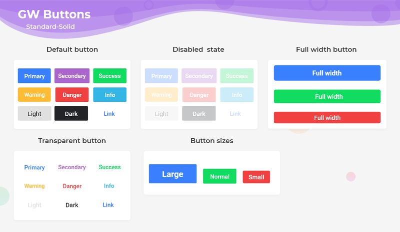
The GF Button is a Flutter Elevated button that has a solid background fill color and the button triggers whenever the action is passed into it.
The default GF button shape is set to GFButtonShape.standard so that we will be able to get the standard shaped button with solid background color with slightly rounded corners.

By default, button type is set to Flutter Solid ButtonGFButtonType.solid so, we can get buttons that have a solid background color with slightly rounded corners.
The callback is called when the button is tapped. By adding a callback to the onPressed parameter it enables the button.
 import 'package:getwidget/getwidget.dart';

  GFButton(
    onPressed: (){},
    text: "primary",
  ),
Flutter Elevated Disable Button is achieved when the callback and onPressed are null, then the button will be disabled. Default GFButton will be disabled as onPressed is set to null.
import 'package:getwidget/getwidget.dart';

GFButton(
    onPressed: null,
    text: "primary",
 ),
In GFButton by adding type,GFButtonType.transparent we will get the transparent button. Default GFButton type will be GFButtonType.solid.
import 'package:getwidget/getwidget.dart';

GFButton(
    onPressed: (){},
    text: "primary",
    type: GFButtonType.transparent,
 ),
The Flutter Elevated Block button specifies how wide the button should be. By setting blockButton state,true it will change the button to a full-width block with rounded corners. Default blockButton is set to false.
import 'package:getwidget/getwidget.dart';

GFButton(
    onPressed: (){},
    text: "primary",
    blockButton: true,
 ),
The Flutter Elevated Full-Width button specifies the button should be in full width of the screen. By setting a fullWidthButton state,true it will change the button to a Full-width button with rounded corners and no border on the left or right side. Default fullWidthButton set to false.
import 'package:getwidget/getwidget.dart';
GFButton(
onPressed: (){},
text: "primary",
fullWidthButton: true,
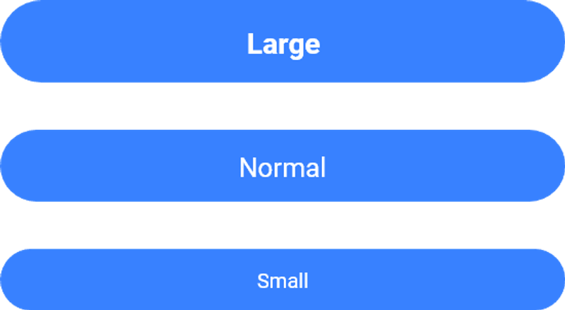
),Flutter Elevated Elevated Button size can be varied using the size property, which specifies the size of the button. Default button size set to GFSize.MEDIUM.
import 'package:getwidget/getwidget.dart';

GFButton(
    onPressed: (){},
    text: "primary",
    size: GFSize.SMALL,
 ),
The Flutter Elevated Outline Button describes the Button with a transparent background and a visible border. This button can be easily found in GFButton by adding type as GFButtonType.outline.
import 'package:getwidget/getwidget.dart';

GFButton(
    onPressed: (){},
    text: "primary",
    type: GFButtonType.outline,
 ),
Above mentioned properties like size, blockButton, fullWidthButton, enabling and disabling of button works well in Elevated Outline Button also.
The Flutter Elevated Outline2x Button describes the Button with a transparent background and a visible border with 2x border width. This button can be easily found in GFButton by adding type as GFButtonType.outline2x.
import 'package:getwidget/getwidget.dart';

GFButton(
    onPressed: (){},
    text: "primary",
    type: GFButtonType.outline2x,
 ),
Above mentioned properties like size, blockButton, fullWidthButton, enabling and disabling of button works fine in Outline2x Button also.