| description |
|---|
GF Flutter Multisecelect is a dropdown that allows users to select one or more items from the list with the help of the checkboxes provided for selection. |
GF Flutter Multiselect lets users select multiple items from the number of Checkbox ListTile items and display selected items in the TitleTile box. It displays a list of items in the overlay dropdown fashion.
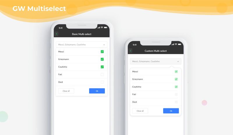
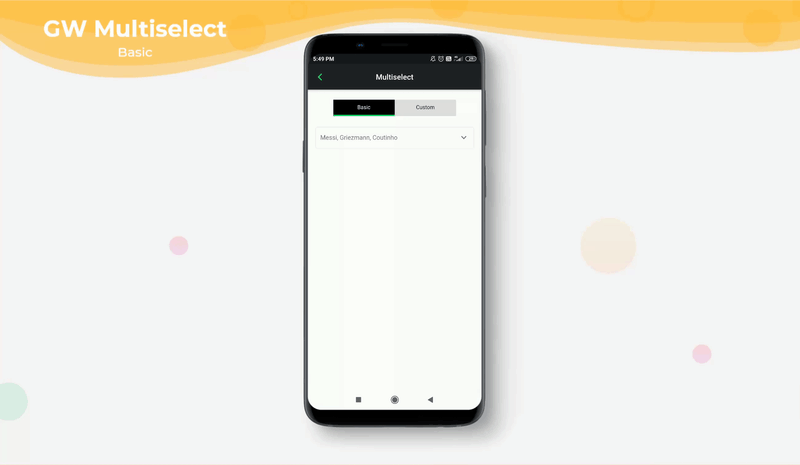
The simple example demo code of a basic GFMultiselect is as shown below.
GFMultiSelect(
  items: dropList,
  onSelect: (value) {
    print('selected $value ');
  },
  dropdownTitleTileText: 'Messi, Griezmann, Coutinho ',
  dropdownTitleTileMargin: EdgeInsets.only(
      top: 22, left: 18, right: 18, bottom: 5),
  dropdownTitleTilePadding: EdgeInsets.all(10),
  dropdownUnderlineBorder:
  const BorderSide(color: Colors.transparent, width: 2),
  dropdownTitleTileBorder:
  Border.all(color: Colors.grey[200], width: 1),
  dropdownTitleTileBorderRadius: BorderRadius.circular(5),
  expandedIcon: const Icon(
    Icons.keyboard_arrow_down,
    color: Colors.black54,
  ),
  collapsedIcon: const Icon(
    Icons.keyboard_arrow_up,
    color: Colors.black54,
  ),
  submitButton: Text('OK'),
  cancelButton: Text('Cancel'),
  dropdownTitleTileTextStyle:
  const TextStyle(fontSize: 14, color: Colors.black54),
  padding: const EdgeInsets.all(6),
  margin: const EdgeInsets.all(6),
  type: GFCheckboxType.basic,
  activeBgColor: GFColors.SUCCESS,
  activeBorderColor: GFColors.SUCCESS,
  inactiveBorderColor: Colors.grey[200],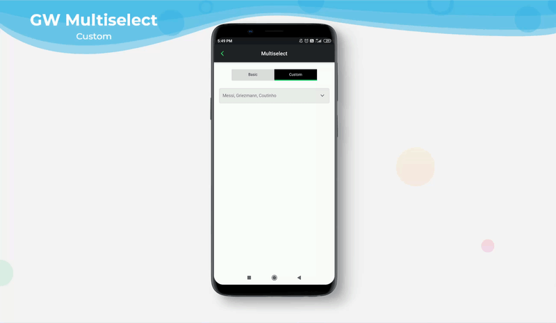
),GFMultiselect features allow users to create a customized multi-select dropdown for the more flexible and interactive UI design.
The below example code gives the basic Flutter Multi Select option in flutter app
Container(
  child: GFMultiSelect(
    items: dropList,
    onSelect: (value) {
      print('selected $value ');
    },
    dropdownTitleTileText: 'Messi, Griezmann, Coutinho ',
    dropdownTitleTileColor: Colors.grey[200],
    dropdownTitleTileMargin: EdgeInsets.only(
        top: 22, left: 18, right: 18, bottom: 5),
    dropdownTitleTilePadding: EdgeInsets.all(10),
    dropdownUnderlineBorder: const BorderSide(
        color: Colors.transparent, width: 2),
    dropdownTitleTileBorder:
    Border.all(color: Colors.grey[300], width: 1),
    dropdownTitleTileBorderRadius: BorderRadius.circular(5),
    expandedIcon: const Icon(
      Icons.keyboard_arrow_down,
      color: Colors.black54,
    ),
    collapsedIcon: const Icon(
      Icons.keyboard_arrow_up,
      color: Colors.black54,
    ),
    submitButton: Text('OK'),
    dropdownTitleTileTextStyle: const TextStyle(
        fontSize: 14, color: Colors.black54),
    padding: const EdgeInsets.all(6),
    margin: const EdgeInsets.all(6),
    type: GFCheckboxType.basic,
    activeBgColor: Colors.green.withOpacity(0.5),
    inactiveBorderColor: Colors.grey[200],
  ),
),The look and feel of the **GFMultiselect **can be customized using the GFMultiselect properties.
| Name | Description |
|---|---|
| items | defines the list of items the user can select |
| onSelect | callback when user select item from the dropdown, in callback we get list of selected items index |
| dropdownTitleTileText | type of [String] to define the dropdownTitleTile title |
| dropdownTitleTileTextStyle | type of [TextStyle] to define the textStyle of [dropDownTitleTileText] |
| dropdownTitleTileHintText | type of [String] to define the dropdownTitleTile hint text |
| dropdownTitleTileHintTextStyle | type of [TextStyle] to define the textStyle of [dropDownTitleTileHintTextStyle] |
| dropdownTitleTileBorderRadius | defines the border radius of the dropdownTitleTile |
| dropdownTitleTileBorder | defines the border of the dropdownTitleTile. |
| dropdownTitleTileColor | defines the background color of dropdownButton |
| hideDropdownUnderline | on true state, it hides the Dropdown Underline border defaults value is false |
| dropdownUnderlineBorder | defines the border of the Dropdown Underline border |
| dropdownTitleTileMargin | defines the dropdownTitleTile margin |
| dropdownTitleTilePadding | defines the dropdownTitleTile padding |
| expandedIcon | defines the dropdownTitleTile's trailing icon when dropdown is visible |
| collapsedIcon | defines the dropdownTitleTile's trailing icon when dropdown is not visible |
| submitButton | defines the button in the dropdown |
| color | defines dropdown checkbox ListTile's background color. Can be given [Color] or [GFColors] |
| avatar | type of [Widget] or [GFAvatar] used to defines dropdown checkbox ListTile's leading |
| margin | defines the margin of dropdown checkbox ListTile |
| padding | defines the padding of dropdown checkbox ListTile |
| type | defines dropdown ListTile's checkbox type type of [GFCheckboxType] which is of four type is basic, sqaure, circular and custom |
| size | defines dropdown ListTile's checkbox size type of [double] which is GFSize ie, small, medium and large and can use any double value |
| activeBgColor | defines dropdown ListTile's checkbox background color when its active type of [Color] used to change the backgroundColor of the active checkbox |
| inactiveBgColor | defines dropdown ListTile's checkbox background color when its inactive type of [Color] used to change the backgroundColor of the inactive checkbox |
| activeBorderColor | defines dropdown ListTile's checkbox border color when its active type of [Color] used to change the border color of the active checkbox |
| inactiveBorderColor | defines dropdown ListTile's checkbox border color when its inactive type of [Color] used to change the border color of the inactive checkbox |
| activeIcon | defines dropdown ListTile's checkbox's active icon type of [Widget] used to change the checkbox's active icon |
| inactiveIcon | defines dropdown ListTile's checkbox's inactive icon type of [Widget] used to change the checkbox's inactive icon |
| customBgColor | type of [Color] used to change the background color of the custom active checkbox only |
| selected | To have the list tile appear selected when the checkbox is checked, pass the same value to both. Normally, this property is left to its default value, false. |
| dropdownBgColor | defines the background color of the dropdown. Can be given [Color] or [GFColors] |