| description |
|---|
GF Flutter Progress Bar is a simple Widget that shows the progress of any task along a line or along a Circle progress bar. |
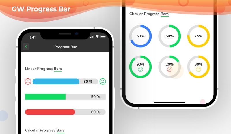
GFProgress Bar is a Flutter Progress bar or a Flutter Progress Button that tells the percentage of progress done in any given task or work.
GFProgress bar can be of two types, a simple linear progress bar or a Circular Progress bar.
A Linear Progress Bar is a progress bar that has a straight line of progress percentage shown on them. The below code shows a simple Linear progress bar with some defined properties of the progress bar.

import 'package:getwidget/getwidget.dart';
GFProgressBar(
percentage: 0.9,
backgroundColor : Colors.black26,
progressBarColor: GFColors.DANGER
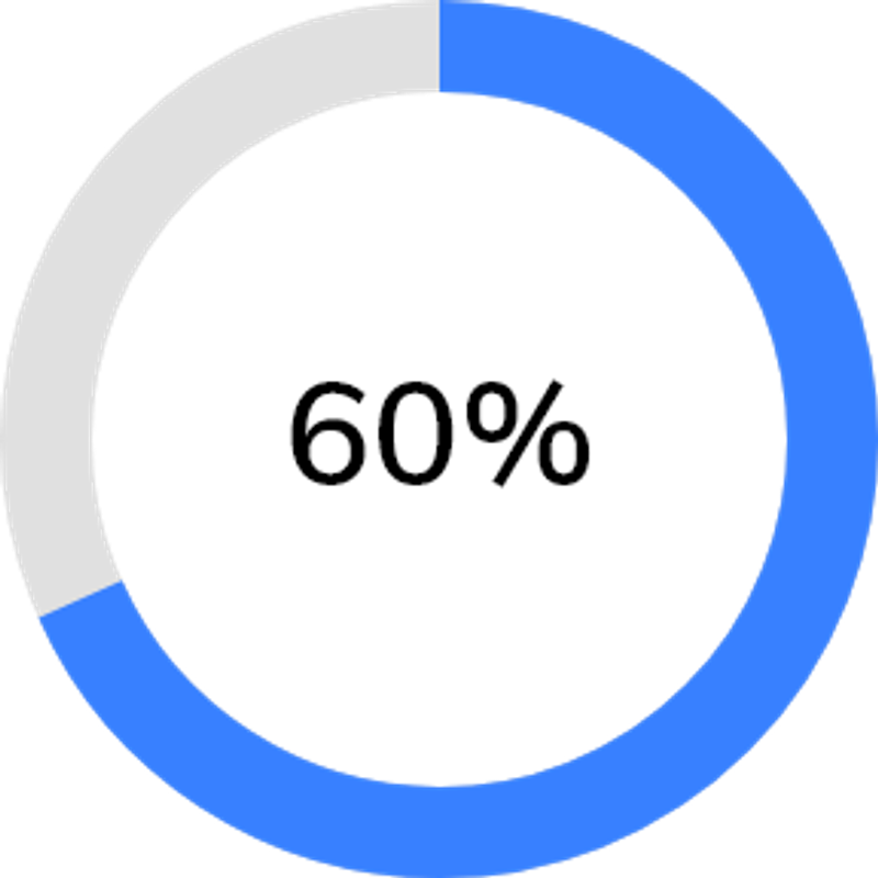
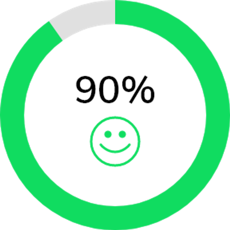
)The Circular progress bar is as same as the linear progress bar with some additional properties added to the code structure. The Circle Progress Bar will be basically a circle in shape and the percentage will be shown inside the circle as shown in the below image. The below code shows a simple circular progress bar.
import 'package:getwidget/getwidget.dart';

 GFProgressBar(
     percentage: 0.9,
     width:100,
     radius: 90,
     type: GFProgressType.circular,
     backgroundColor : Colors.black26,
     progressBarColor: GFColors.DANGER
)The progress bar can be customized to show the percentage of progress completed. To show the progress percentage we can use child property which is a Widget type and can be a text, icon, image, etc. The below code shows how a child's property can be used as text to show the progress percentage.
import 'package:getwidget/getwidget.dart';

GFProgressBar(
    percentage: 0.5,
    lineHeight: 20,
    child: const Padding(
        padding: EdgeInsets.only(right: 5),
        child: Text('50%', textAlign: TextAlign.end,
                    style: TextStyle(fontSize: 16, color: Colors.white),
               ),
        ),
     backgroundColor: Colors.black26,
     progressBarColor: GFColors.WARNING,
)The progress bar can be used with leading and trailing icons to show the level of progress percent from 0 to 1. The below code shows leading and trailing icons in a Linear Progress bar.

import 'package:getwidget/getwidget.dart';

GFProgressBar(
     percentage: 0.8,
     lineHeight: 20,
     alignment: MainAxisAlignment.spaceBetween,
     child: const Text('80%', textAlign: TextAlign.end,
                  style: TextStyle(fontSize: 16, color: Colors.white),
                  ),
     leading  : Icon( Icons.sentiment_dissatisfied, color: GFColors.DANGER),
     trailing: Icon( Icons.sentiment_satisfied, color: GFColors.SUCCESS),
     backgroundColor: Colors.black26,
     progressBarColor: GFColors.INFO,
)The Look and feel of GFProgressBar can be customised using the following properties:
| Name | Description |
|---|---|
| percentage | type of double which should be from 0 to 1 to indicate the progress percentage |
| radius | type of double used to show the radius of the Circular Progress Bar |
| width | defines the width of the progress bar |
| type | type of [GFProgressType] which changes the shape of progress bar ie , linear or circular |
| lineHeight | defines the height of the progress bar |
| circleWidth | defines the thickness of the circle's arc in Circular Progress bar |
| circleStartAngle | defines the angle on which the circle starts to progress in degrees.(ie 0.0, 45.0, 90.0 etc) |
| animation | type of bool which allows the progress line to animate when the percentage value is changed, default is false |
| animationDuration | duration of animation in milliseconds , applicable only if animation is true |
| alignment | used to align the leading and trailing widget which the progress bar evenly |
| padding | defines the padding of the progress bar |
| animateFromLastPercentage | type of bool which is used to animate the progress bar from the last percentage value set |
| linearGradient | linear gardient colors given to the progress line color |
| autoLive | set to false if you don't want to preserve the state of the widget , default is true |
| fromRightToLeft | set to true if you want to animate the linear progress bar from right to left |
| mask | Creates a mask filter that takes the progress shape being drawn and blurs it |
| clipLinearGradient | set to true if you want to display only a part of [linearGradient] based on percentage value, |
| progressHeadType | type of [GFProgressHeadType] which changes the shape of the progress head ie , circular or sqaure |
| reverse | type to bool which is used to display the progress in reverse direction |