| description |
|---|
GF Flutter Toggle is a custom toggle widget like Square, Android, IOS, and Custom widget with many custom properties to customize as required. |
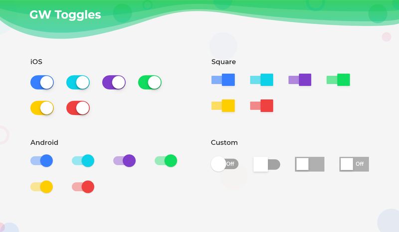
The Flutter toggle switch is ON/OFF switch or ON/OFF Button that allows the user to toggle the switch between ON or OFF states.
GFToggle switch is a Flutter Switch Toggle that permits the user to use this toggle to mark check when it is in ON state and mark unchecked when it is in OFF state. The toggle switch basically switches from ON to OFF state and vice-versa. Let us look at a simple example of GFToggle in the below code.
import 'package:getwidget/getwidget.dart';

 GFToggle(
    onChanged: (val){},
    value: true,
)GFToggle switch can be divided into four types ie, android, ios, square and custom. The default toggle is an android toggle.
Flutter IOS Toggle switch has a circular track and a circular thumb as shown in the below image.
The below example code shows a simple ios toggle
import 'package:getwidget/getwidget.dart';

 GFToggle(
    onChanged: (val){},
    value: true,
    type: GFToggleType.ios,
)The Square Toggle switch has a square-shaped track and a square-shaped thumb as shown in the below image.

The below code shows a simple square toggle
import 'package:getwidget/getwidget.dart';

 GFToggle(
    onChanged: (val){},
    value: true,
    type: GFToggleType.square,
)The custom toggle can be used to add the text to the on/off state. The default text is ON and OFF Below is a simple code for custom toggle

The below example code shows a simple custom toggle switch
import 'package:getwidget/getwidget.dart';

GFToggle(
   onChanged: null,
   value: true,
   type: GFToggleType.custom,
),The look and feel of GFToggle can be customized using the below properties
| Name | Description |
|---|---|
| enabledText | type of [String] used to add custom text i.e, ON, ENABLE |
| disabledText | type of [String] used to add custom text i.e, OFF, DISABLE |
| enabledTextStyle | type of [TextStyle] used to define the style properties of enabled text |
| disabledTextStyle | type of [TextStyle] used to define the style properties of disabled text |
| enabledThumbColor | color used for the active thumb color |
| disabledThumbColor | color used for the disabled thumb color |
| enabledTrackColor | color used for the active track color |
| disabledTrackColor | color used for the disabled track color |
| boxShape | type of [BoxShape] ie , circle, rectangle used to change the shape of the thumb, default shape is circle |
| borderRadius | borderRadius should be given zero for a ios toggle to make it a square toggle with boxshape as rectangle |
| duration | animation duration called when the switch animates during the specific time elapse |