| description |
|---|
GF Flutter Typography defines the different sizes of the texts in the application varying from Type 1 to Type 6. |
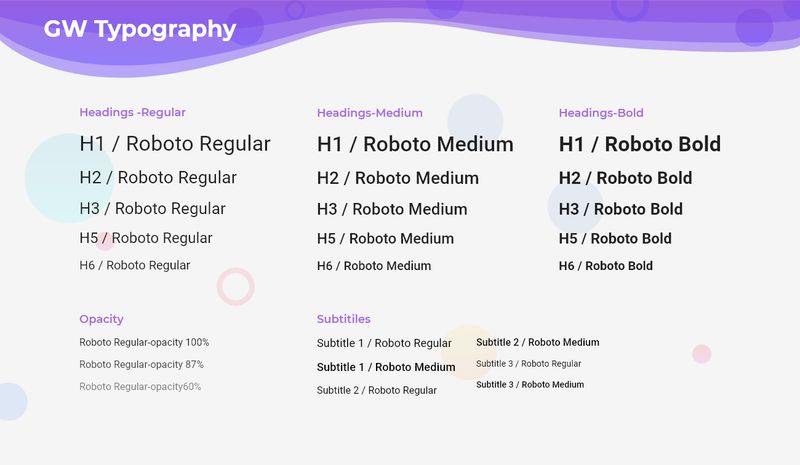
Flutter Typography is the art of arranging letters according to the need in order to make a clean styling of texts and words.
GFTypography is a Flutter Typography that arranges the texts in a clean pattern with font-weight, the font size in order to give a stylish and smooth effect to the words.
The simple GFTypography code is as shown below
import 'package:getwidget/getwidget.dart';

GFTypography(
  text: 'GF Header Typo1',
),GFTypograhy comes in different sizes that vary from Typo1 to Typo6. The below code shows Typo1 example.
import 'package:getwidget/getwidget.dart';

GFTypography(
  text: 'GF Header Typo1',
  type: GFTypographyType.typo1,
),GFTypography comes with different type and it can be used with any kind of icon. The usual usage can be a GFAvatar to show the image and the name as shown in the below example.
import 'package:getwidget/getwidget.dart';

 GFTypography(
   text: 'GF Header Typo1',
   type: GFTypographyType.typo1,
   icon: Icon(Icons.send),
),GFTypography can have a background image in it and the text or icon with the text on it. The background image gives a more specific feature to GFTypography. The below code shows the GFTypography on BackgroundImage.

import 'package:getwidget/getwidget.dart';

GFTypography(
  text: 'GF Header Typo1',
  type: GFTypographyType.typo1,
  icon: Icon(Icons.send),
  backgroundImage: AssetImage('asset image here'),
),The look and feel can be customized using GFTypography properties.
| Name | Description |
|---|---|
| child | child of type Widget alternative to text Key |
| dividerColor | defines the color of the divider |
| textColor | defines the color of the text |
| dividerBorderRadius | the border radius of the divider |
| dividerAlignment | the alignment of the divider to start, center or end |
| showDivider | bool value to hide or show divider , defaults to true |
| dividerWidth | the width of the divider |
| backgroundImagecolorFilter | colorFilter of background image only when background image is available |