#### Description We should not use the color red for these kinds of buttons, at first glance it gives the impression that something went wrong. #### Recomendation Should consider using green buttons for success alerts and buttons with text as "Accept", "Ok" or positive texts to prevent confusion in the UX. #### Screenshots  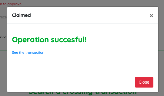
Description
We should not use the color red for these kinds of buttons, at first glance it gives the impression that something went wrong.
Recomendation
Should consider using green buttons for success alerts and buttons with text as "Accept", "Ok" or positive texts to prevent confusion in the UX.
Screenshots