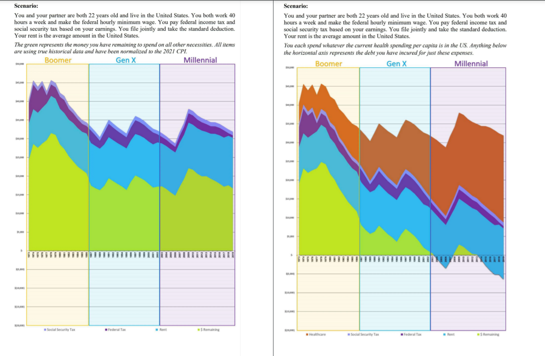
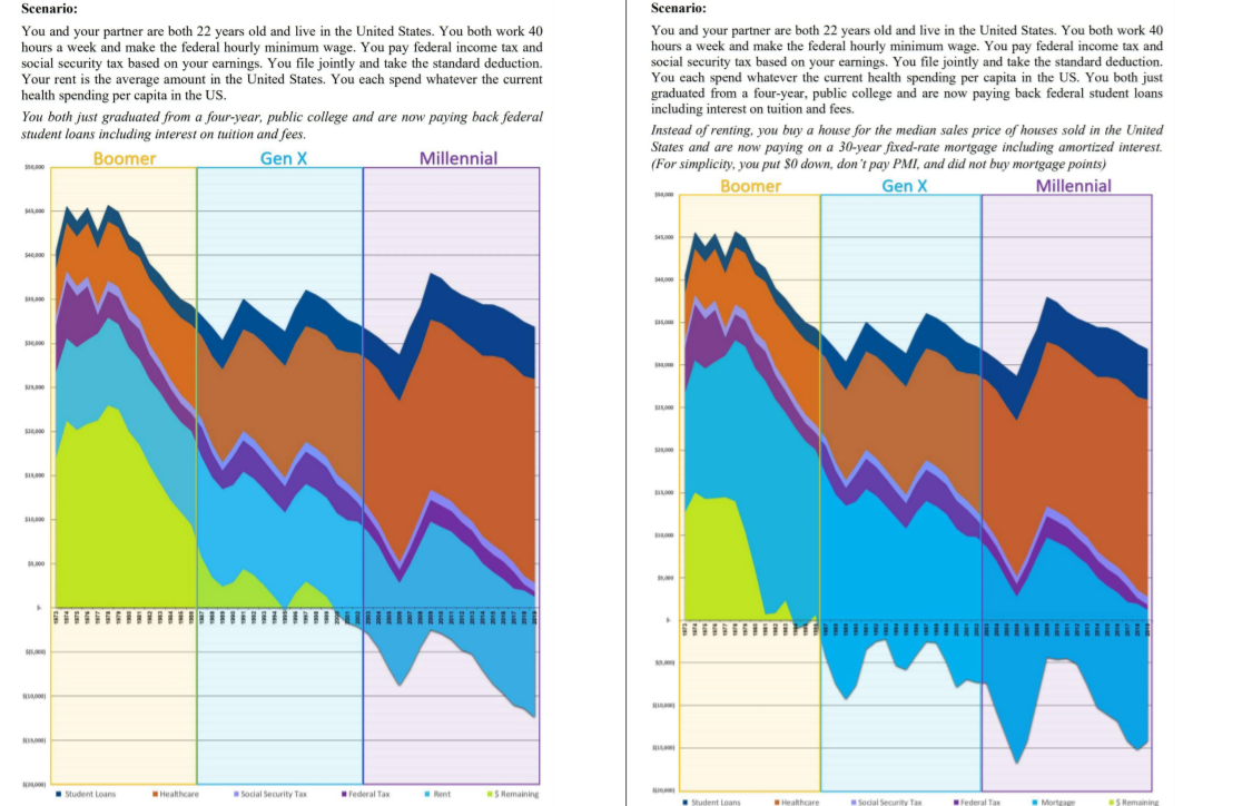
The visualization I've chosen this week is actually a series of four charts, representing the declining purchasing power of minimum wage. It's important to acknoweldge that this is not a representative of the median income; meaning most americans do not live this way, and this is not a representation of a 'budget'. Federal minimum wage was initially devised as enough to cover all of the basic necessities comfortably for a family, at a time in a single-income household. The scenario remains the same for the young couple, but adjusts for inflation based on the cost of basic expensives through each period, with years noted on the x axis.
To an extent, the chart may largely under-report expenses related to childcare, as the price of childcare services have increased much less dramatically than the price of housing and education. However, childcare was not a necessity for the majority of baby boomer households which were able to rely on a single-income, leaving a partner at home to watch their kids. Many millenials are the product of dual-income or single-parent households, as are a larger portion of generation X by comparison to baby boomers, meaning no parent or grandparent can be responsible for childcare. This creates an increasing demand for childcare, putting financial strain on low-income households and discouraging developing adults from having children.
It's also important to note that median values were sampled for income, housing, and healthcare, as the average values for these expenses tend to be highly skewed by small percentages of wildly high costs. The biggest increases in expenses that's affected purchasing power stem from the housing and mortgage, which increased sharply in the late 70s and early 80s during a period of deregulation leading to crushing interest rates. In addition to and as a result of a general shortage of affordable housing and mortgage interest rates still suffering from deregulation, millenials making minimum wage in 2021 typically cannot afford to own property and rent their living spacce, indefinitely sacrificing large portions of income making it incredibly difficult to save money. The visualization shows the sharp increase in the cost of housing between the late 60s and early 70s as opposed to the periods following the 80s-90s to present day, indicating that we still have not recovered from the affects of the sharp inflation that occurred in the early 80s. Additionally, the cost of healthcare has increased dramatically over the last 70 years, which is a uniquely American heavy expense on minimum wage workers by comparison to other first-world countries with comparable GDPs.
The essential takeaway is that a few generations ago, someone born at the time could have made minimum wage, paid for health insurance, provided for a house house and still had money left over at the end of the month. Unfortunately, many people who experienced this reality are law makers and policy enforcers, who are unable to grasp the magnitude by which the cost of living has increased, leading to the delibatitng wealth disparity observed in modern America that disturbingly continues. I would say this visualization could use more descriptive captioninig to explain the implications of the chart, as my deductions required a considerable amount of additional research.
This was kind of cynical, here's a kitten :