This data shows the number of deaths by suicide, firearms, and alcohol based on age group, race, and sex.
Source: Data World Different Deaths by Age, Race, and Sex
The following tasks and questions will drive the visualization and interaction decisions for this project:
- What ages have the highest suicide rates?
- What ethnicities have the highest suicide rates?
- What ages have the highest firearm deaths?
- What ethnicities have the highest firearm deaths?
- What ages have the highest alcohol-related deaths?
- What ethnicities have the highest alcohol-related deaths?
- How does sex relate to the type of death (firearm, alcohol, suicide)?
- How do these trends change over time? Do death rates go up or down for certain groups?
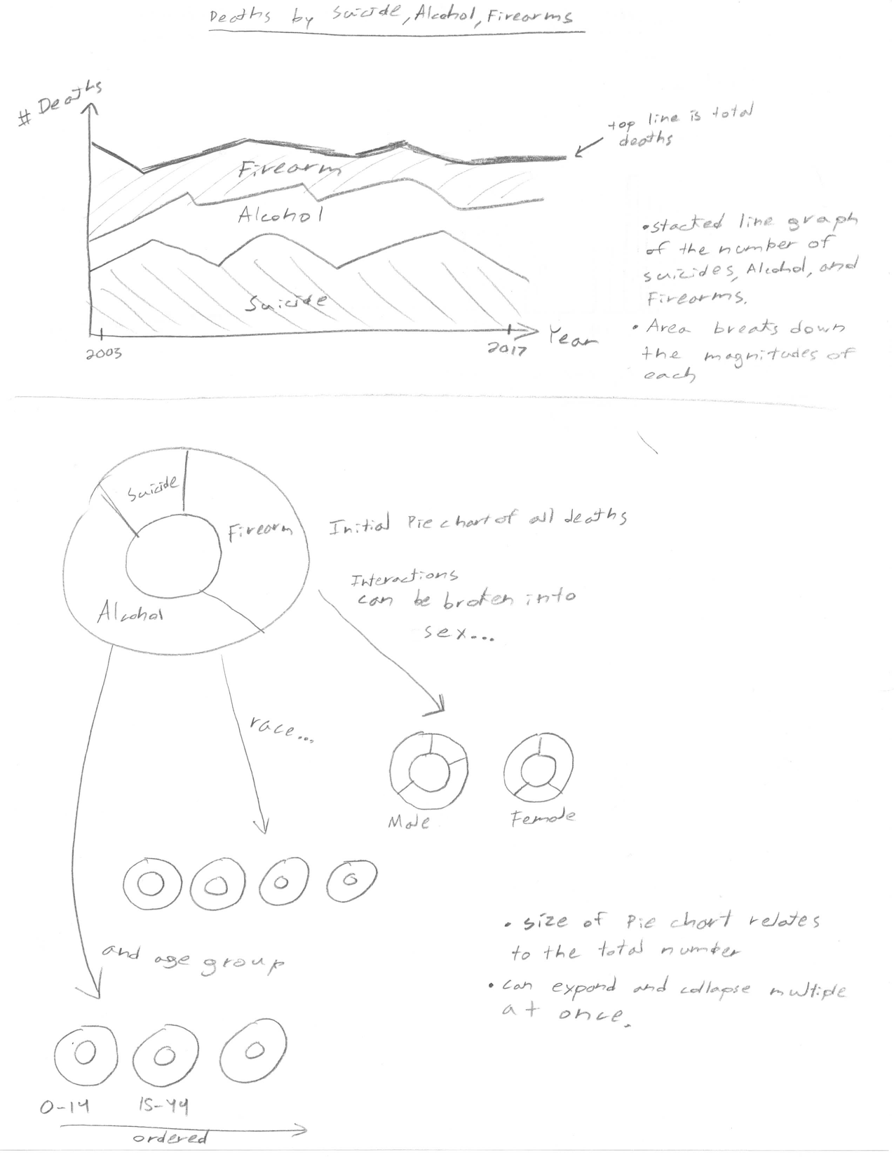
On the top of this sketch, we can see the amount of deaths over time, along with the breakdown into various categories. On the bottom of this sketch, we can see donut chart breakdowns across various groups.
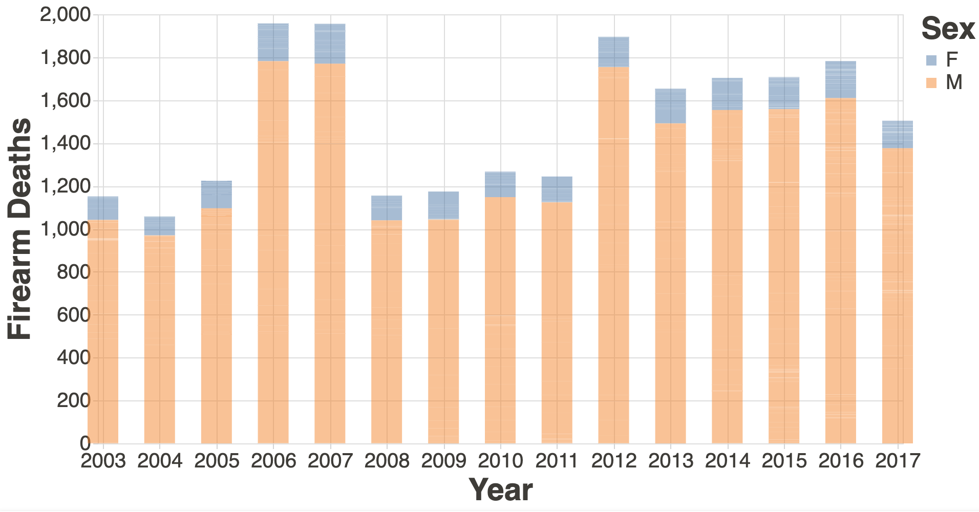
I’ve created a proof of concept visualization of this data with the Vega-Lite-Api. It's a bar graph and it shows the number of firearm deaths over time, split among sex.
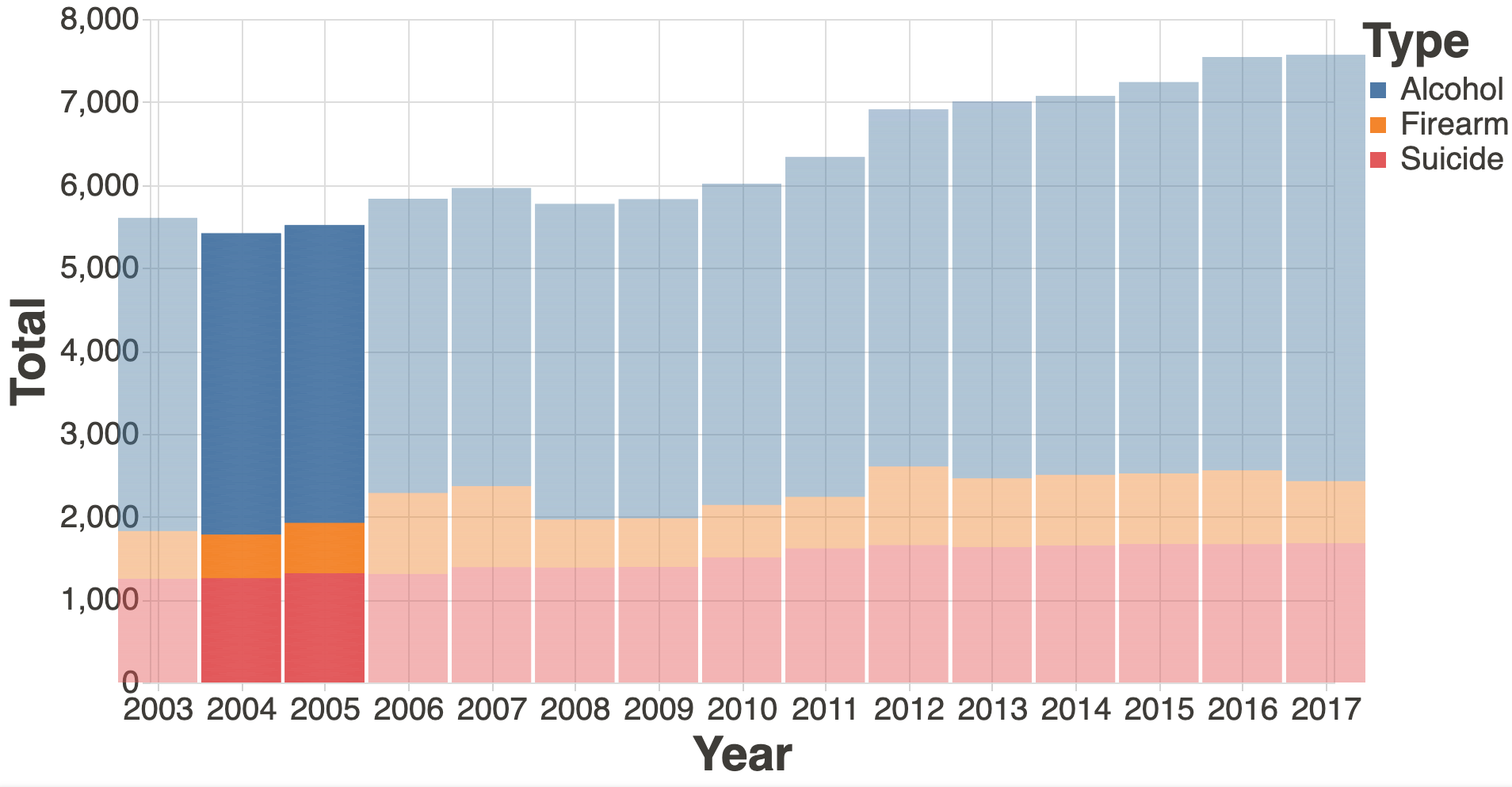
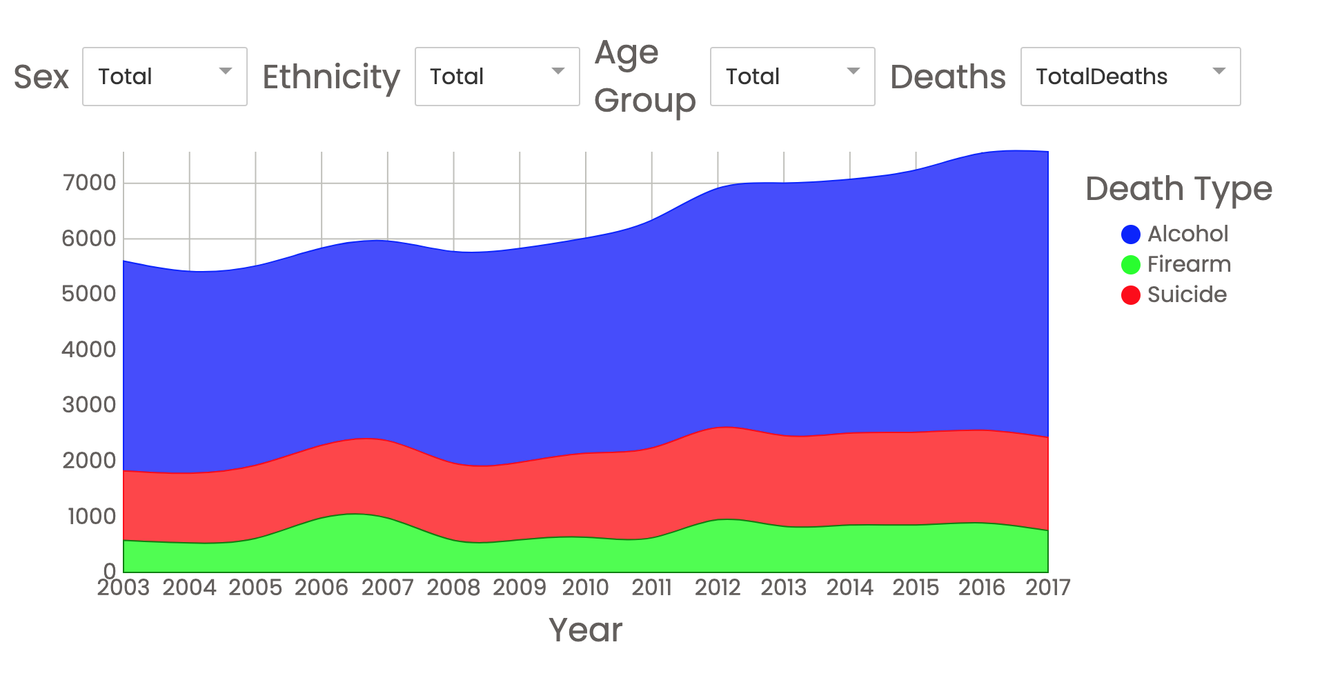
I've also created a stacked bar/"line" graph with the Vega-Lite-Api that shows the numbers of deaths over time broken down by each cause.
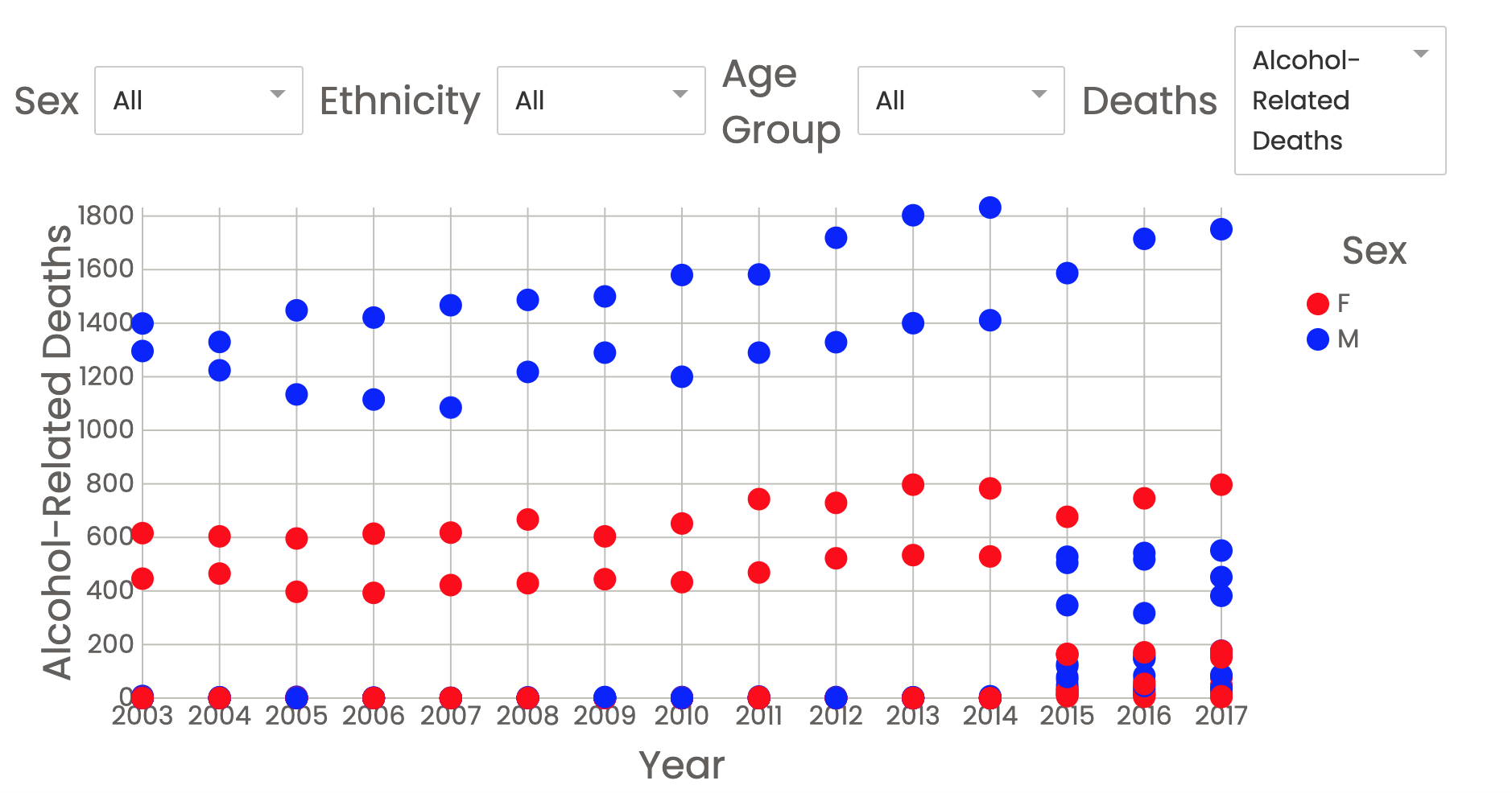
I then transitioned to working with D3 and React. This is a scatter plot that shows the number of different deaths with each data point representing a different group of sex, ethnicity, and age group. These points are colored differently for males and females.
This is a line graph in D3 and React. It shows the trend of different deaths over time for all classifiers. Each line is a different death type, but each line represents all of the sexes, ehtnicities, and age groups.
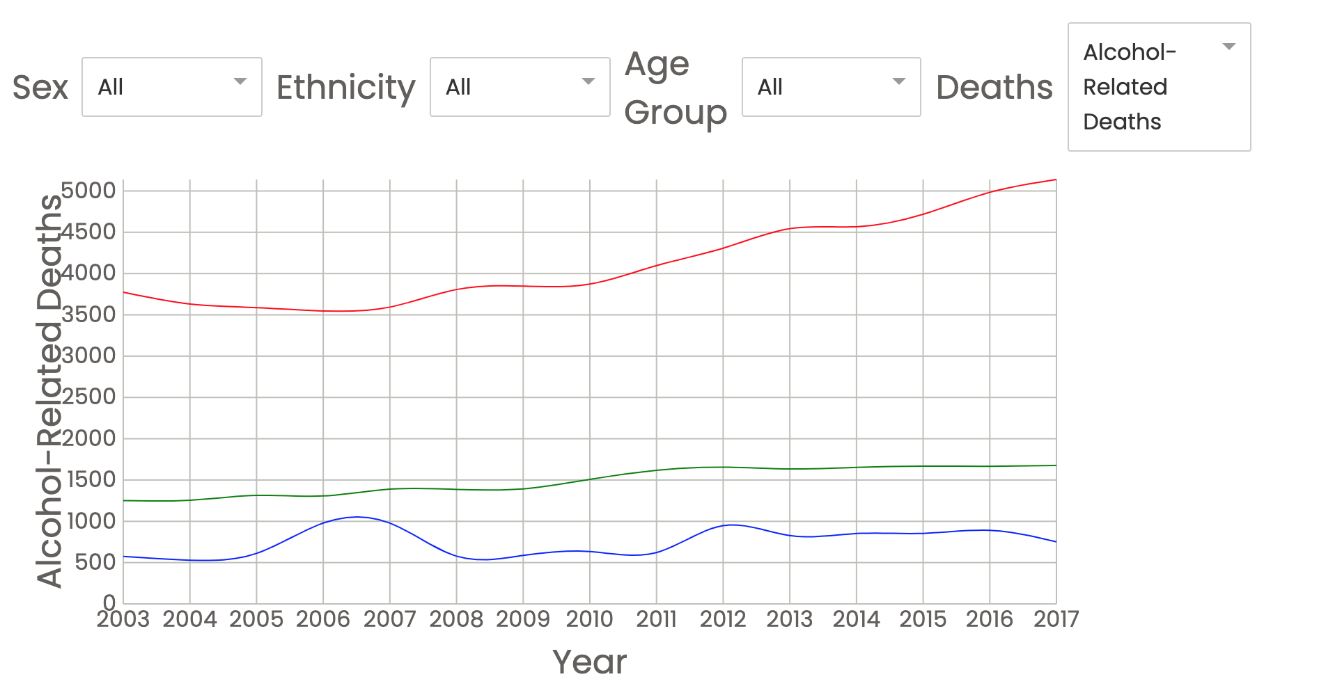
This is the final D3 and React visualization. It is a stacked line graph that shows the trend of each death type over time. If a viewer wishes to interact with the visualization, they may filter by different sex, ethnicity, and age group. The user may also hover over the legend and the corresponding area will be highlighted out among the rest.
This visualization answers the question of which deaths change over time. It shows the total number of deaths when the entire area is used. Different questiosn can be asked by the viewer when they filter the data and view the corresponding trends.
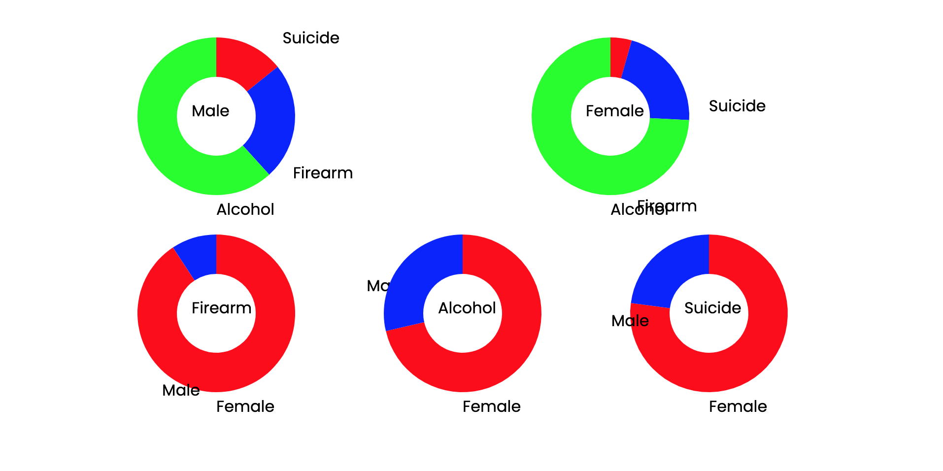
This is the start of the pie chart breakdown I was driving towards. The label formatting is still in a prototype stage, but it is effective in showing the data. This visualization answers the question that both sexes have the same general breakdown of death type where there are the most Alcohol deaths, followed by Alcohol and Suicides. It shows that Females have about 75% Alcohol deaths whereas Males have had about 60% Alcohol deaths. Another thing this visualization shows is the breakdown of each death type by sex. In all three death types, there are siginificantly more male deaths than female deaths, off of the death count used in this study. With the alcohol-related-deaths, we see that there is a closer number of female deaths to male deaths.
One of my challenges was finding documentation for the Vega-Lite-Api. Another challenge was React, D3, and the newest Javascript version at the same time. Sometimes I was unsure which framework the code I was confused at vieweing was from.
I am still unsure of the most interesting and efficient way to describe all of this data at once.
Potential interactions can include:
- A menu on the stacked line chart to filter by the different types of (suicide, firearm, alcohol).
- One pie graph that can be broken into smaller pie graphs with a different pie graph showing death type for each demographic (sex, ethnicity, age-group).
- Hovering over one demographic will highlight it in other visualizations.
- Hovering a point in time on the stacked line graph will show a breakdown of the demographics for those deaths, similar to the streamgraph example in the Effective Visualizations video.
- Create menu for pie graph that will filter the current pie graph by demographic.
- Create breakdown of pie chart into smaller pie charts by demographics so there are multiple pie graphs
- Add hovering visualizations that align the stacked line graph to the pie graphs.