Assignment 2 - Data Visualization, 5 Ways
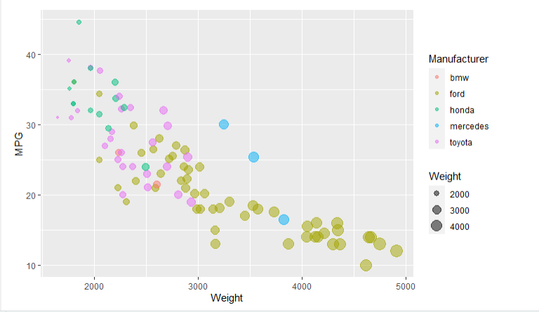
R is a language primarily focused on statistical computing. ggplot2 is a popular library for charting in R. R Markdown is a document format that compiles to HTML or PDF and allows you to include the output of R code directly in the document.
To visualized the cars dataset, I made use of ggplot2's geom_point() layer, with aesthetics functions for the color and size.
While it takes time to find the correct documentation, these functions made the effort creating this chart minimal.
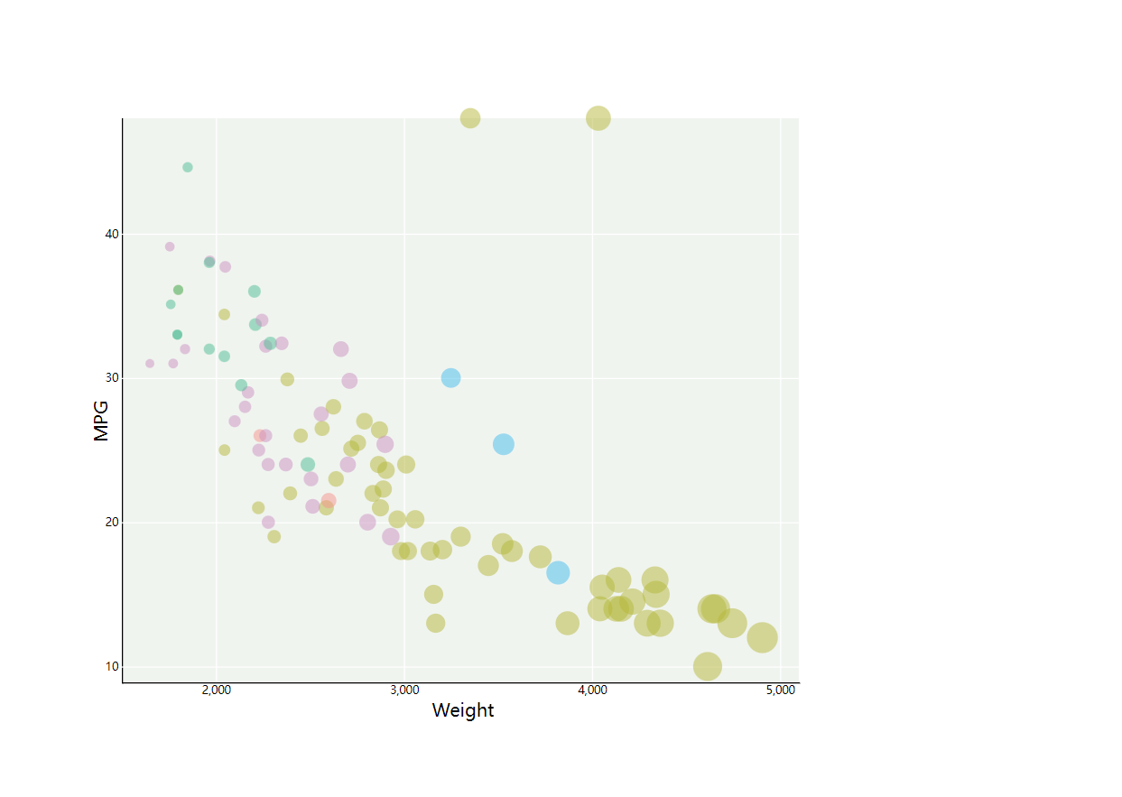
I didn't use D3 before and what I know is just to use tools like powebi to showcase data.in Assignment 1,I learned a lot about the D3 and it's also the first stuff that jump out of my mind.
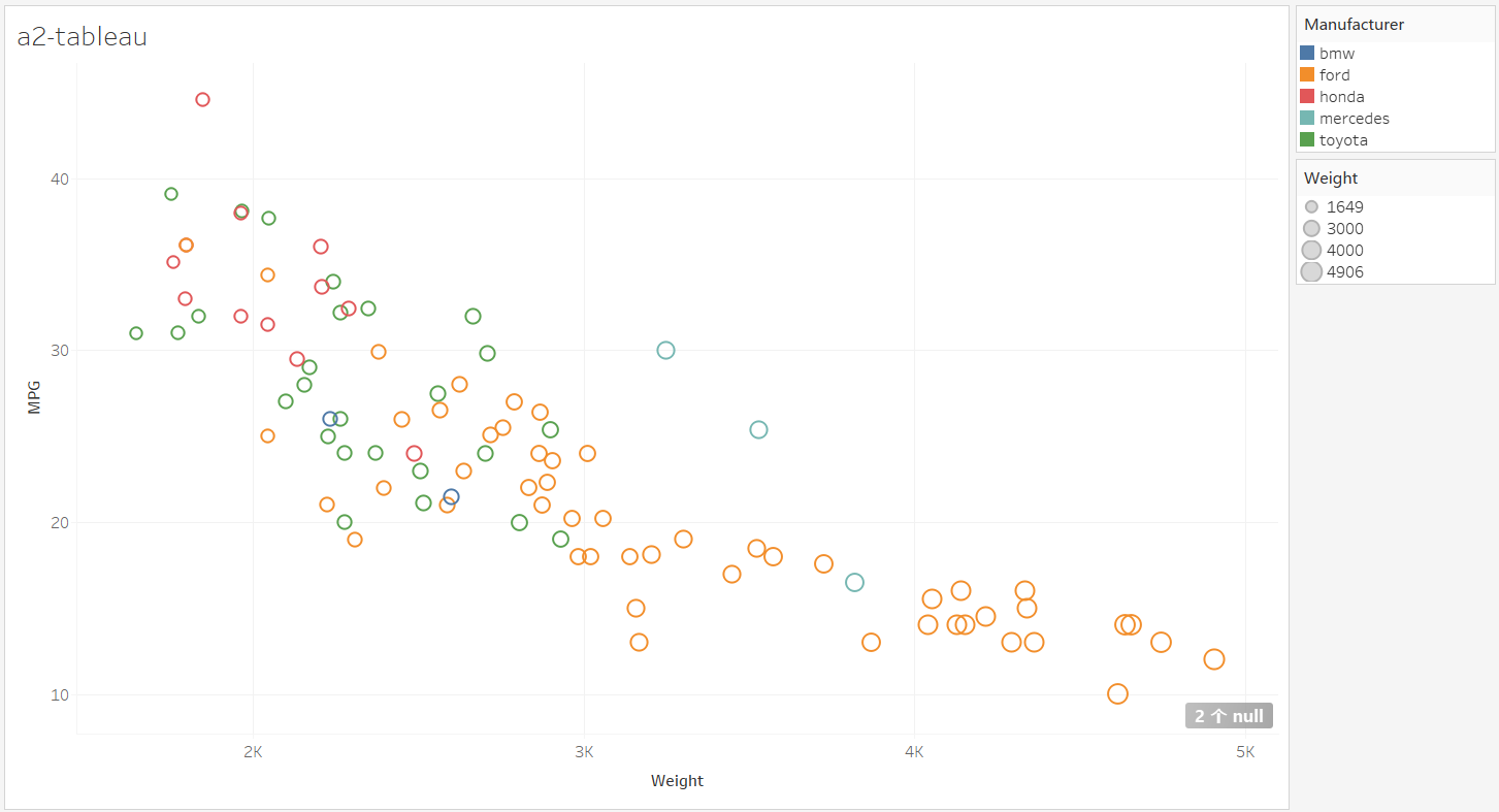
The tableau is what I used before and I think it's like most of bi software on the market. So it's easy for me to use it.
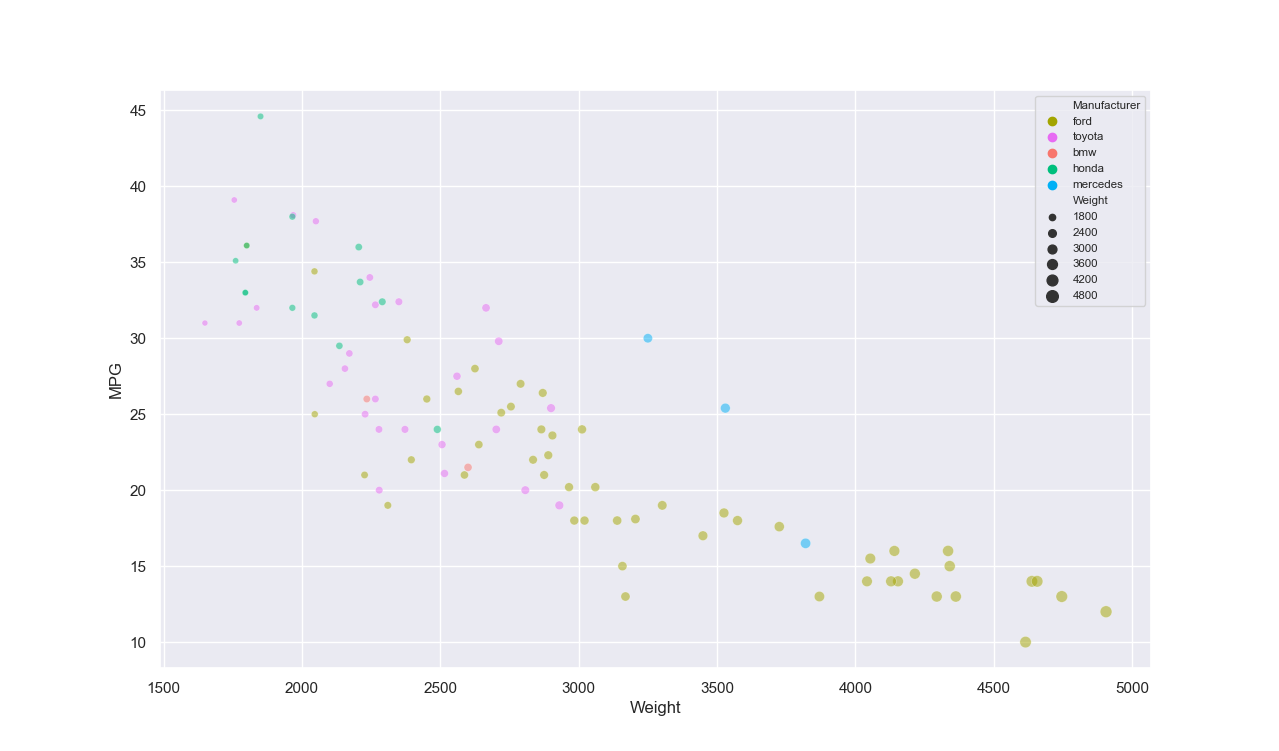
Matplotlib is a plotting library for the Python programming language and its numerical mathematics extension NumPy. It provides an object-oriented API for embedding plots into applications using general-purpose GUI toolkits like Tkinter, wxPython, Qt, or GTK+.
The pro of matplotlib is it has very powerful function of plotting and can be combined with data analysis. The con of matplotlib is that we can't export results to web page directly, so I think it's not very suitable for web based visualization development.
Seaborn is a Python data visualization library based on matplotlib. It provides a high-level interface for drawing attractive and informative statistical graphics
here is the description of the features: https://flourish.studio/features/
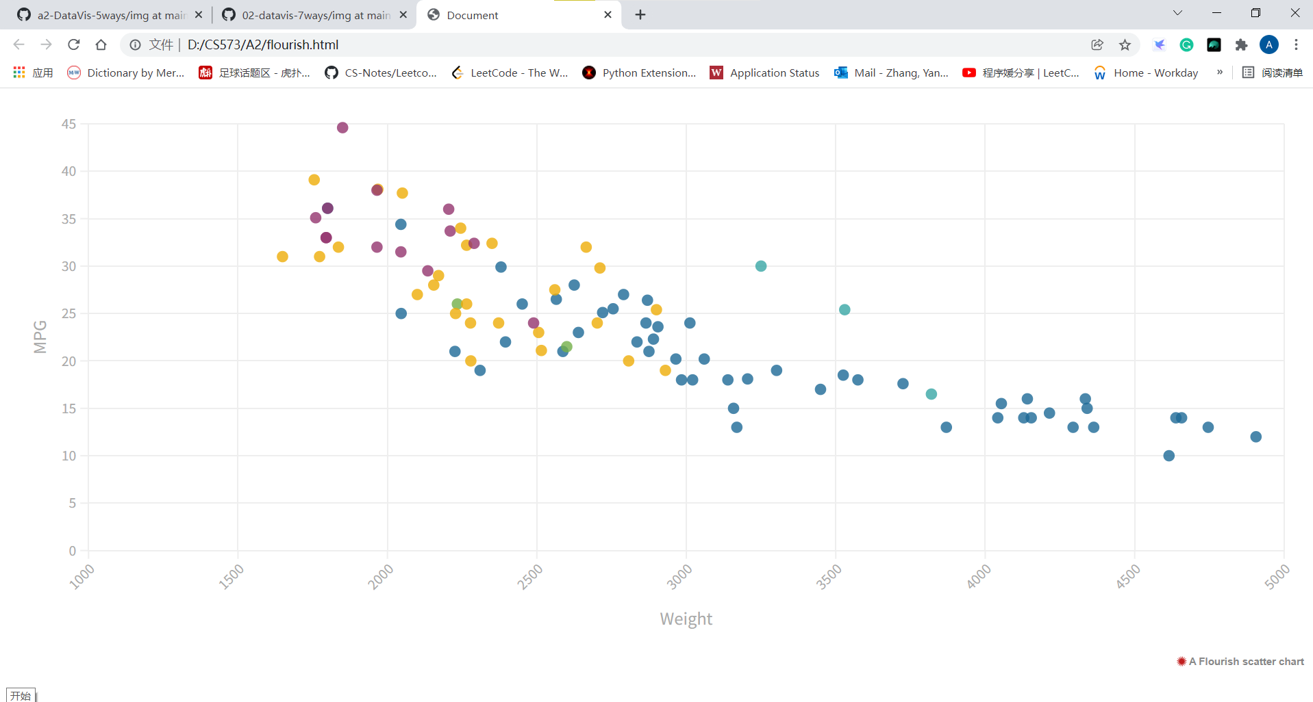
Flourish is an online data visualization tool. It's more easy to use than Tableau, and most importantly, it's free. For individuals, Flourish is good enough.
Acheivments:
From this assignment, I learned a lot about the d3 development skills and reviewed the previous knowledges. I like the pace of learning.