This is a simple, full-screen responsive layout template for web mapping projects. It can save you some time scaffolding your project so you can focus on everything else.
It features a top nav, fixed width sidebar, and main map area. On mobile devices (less than 800px wide), the map and sidebar orientation is changed to column, with the map on top taking 60% of the vertical height.
I teach web mapping at NYU, and made this to help my students with a ready-to-use layout that won't break on mobile devices.
Clone this repository, and open index.html using a local webserver. I prefer using the Live Server extension for vs code.
That's it. index.html contains the html and css, along wtih some minimal code to create a Mapbox GL JS map in the #map container.
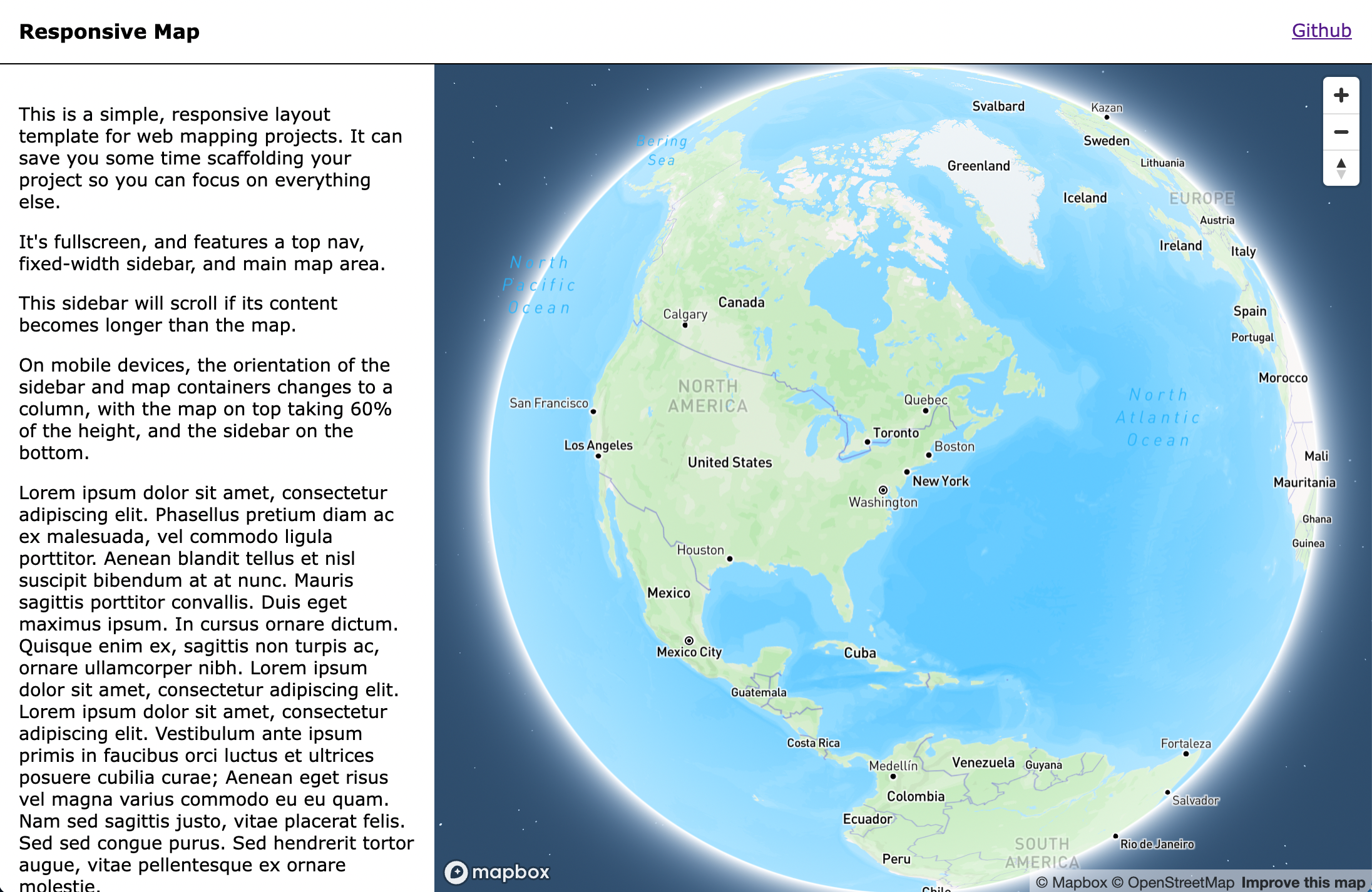
Desktop
Mobile

I would love your help improving this or fixing bugs. Feel free to open an issue or pull request here.
Contact me on twitter at @chris_whong if you have any questions or feedback.