Modular, easy to upgrade and high performance CSS framework
- You need Node > v12
- Our tool basecore-cli
- A Javascript Framework of your choice ( right now we support Vanila Javascript with Parcel with React + Vue in the future )
First, install Parcel:
npm i -g parcel-bundler
We recommend this two plugins for parcel posthtml-modules and posthtml-expressions
npm i --save posthtml-modules

npm i --save posthtml-expressions
You'll need them to open the Kitchen Sink were you can preview all baseCore components, you can use them to build static html.
For Parcel to work nice with baseCore you need to create this two files in your project
.sassrc
{
    "includePaths": ["node_modules"]
}
.posthtmlrc
{
  "plugins": {
    "posthtml-modules": {
      "root": "./src"
    }
  }
}
Start Parcel and have fun :)
parcel ./src/pages/index.html --open
Just follow basecore-cli instructions
baseCore is a framework created using the knowledge of both UI designers and Frontend Developers, targeting reusability, accesibility and a low Kb weight size and a extremely easy way to customize components.
Our mission is to create an easy to use framework that allows everybody in the Team to create a project ASAP, for this we've inspired our framework in the Atomic Design methodology
tldr; Atomic Design separates components in:
| Type | Description |
|---|---|
| Atoms | A simple element like a Button |
| Molecules | More than one Atom together |
| Cells | This doesn't exist in the regular Atomic Design. We'll talk about it later |
| Organisms | More than one Molecule / Cell together |
| Templates | A whole page with Organisms, Molecules, etc but with dummy content, like a prototype. |
| Pages | A final Template but with final content |
A single button:
Two Atoms (buttons) together:
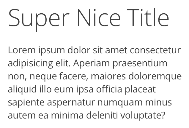
Another two Atoms together: a title and a paragraph tag:
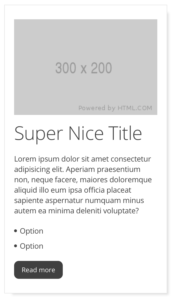
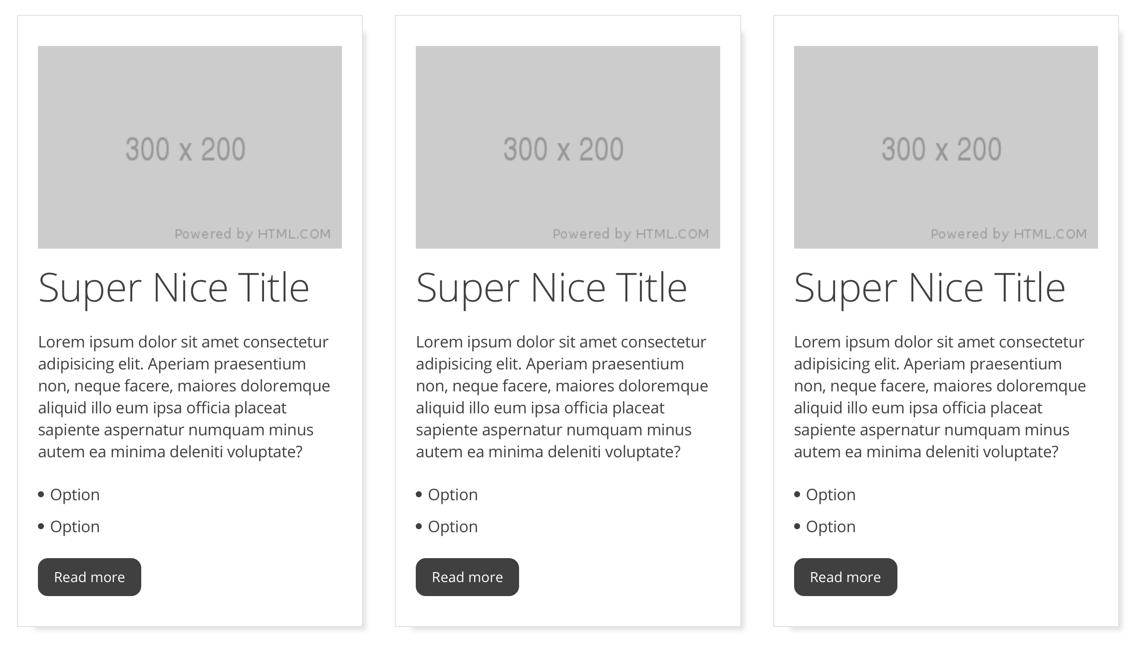
Three atoms Image + Title + Paragraph + List ( Molecule ) + button, all of them inside a Cell
This case is a special one because Atomic Design dictates that component should be an Organism, but we're calling it also a Molecule ( or a Mega Molecule for use of different name ) . We only define a Component as an Organism if that Component has Javascript logic. More on this later.
A Cell is the container of others Atoms + Molecules, think of it as the typical card component, a Component container with CSS for only its own padding, background color, margin, etc. But with no content insideas the content style and functionality aren't define by the Cell as every Atom and Molecule has its own CSS and Javascript, more on this later on.
Every component has its own SCSS, Javascript, Markdown and HTML files, all of them starting with an underscore in its file name so we know it's a partial element of the component.
| Name | Description |
|---|---|
| _name.scss | Component visuals |
| _name.js | Component logic |
| _name.html | Component markup |
| _name.md | Markdown document for documentation |
Every line of code should only affect the component itself, never its parents or his children, for example if a Molecule interacts with another Molecule then the two of them should be organized inside a Organism.
In UI Design the complexity of the component defines if it's an Atom, a Molecule or an Organism, in code we have to twist that a litte, we use the scope of interaction to separate the components:
| Component | Description |
|---|---|
| Atom | Has no Javascript or hast it only to interact within itself |
| Molecule | Has no Javascript or hast it only to interact within itself |
| Organism | Has Javascript that affects the children within |
| Cell | Has no Javascript as it's only "a shell" |
Imagine a search page, you have the Search Input, the Search Button and the Results, all in the same page.
When you click on the Search Button, the Buttons changes and shows a loading animation, 1 second after, the Results starts to show your favourite products.
Search Input => Atom 1
Search Button => Atom 2
Search Input + Search Button => Molecule 1
Result Product => Molecule 2
A grid of 9 Result Products => Mega Molecule 1
Molecule 1 + Mega Molecule 1 => Organism 1
Lets review the logic of every element:
Atom 1: Has no Javascript Logic
Atom 2: Has no Javascript Logic
Molecule 1: Has Javascript logic so it can change the Search button
Organism 1: Has Javascript Logic, when we press the Search Button we call a web service that once we've parsed it we create the grid of 9 products
By doing this, we can make multiple and different Result pages using the same Molecules in just seconds because they have all we need except the web service logic.
So Atoms, Molecules and Cells are highly reusable, and since every one of them will just be imported / referenced in the whole project if we need to make a change, we only have to do it in one component and everything will propagate with no effort. As you can already see, Organisms aren't meant to be reused but you can if you want to, though. In the previous example you could integrate the Organism 1 in any other page, as it already has everything needed in itself to just work.
src/
    app/
    components/
        _atoms/
        _molecules/
        _organisms/
        _cell/
        _layout/
        _utils-js/
        _utils-sass/
        _vendor/
    fonts/
    img/
    pages/
    scss/
    svg/
| Name | Description |
|---|---|
| app/ | Config your app here, imports, etc. |
| components/_atoms/ | Atoms, put yours here too |
| components/_molecules/ | Molecules, put yours here too |
| components/_organisms/ | Organisms, put yours here too |
| components/_cell/ | Cells, put yours here too |
| components/_layout/ | Define your layouts here |
| components/_utils-js_/ | Some Javascript utilities, small plugins ready to go |
| components/_utils-sass_/ | Some Sass utilities like CSS Grid, Browser Fixes, etc. |
| fonts/ | Put all your custom Fonts here |
| img/ | Put all your images here |
| pages/ | Create different .html files here for static projects |
| scss/ | You can import al the components SCSS in here |
| svg/ | Store your svg and icons in here |
You can import your Javascript Modules in the /app/_app.js file, and you can do the same with the SCSS in the scss/styles.scss if you want.
baseCore gets its name from this concept: Split the code in Core code and Custom Core.
This is the code you shouldn't have to touch ( we should maintain it for you! ) because it contains logic that should change, for instance, a modal always has the same logic: You push a button and you get a modal window. This logic is within the node_modules and can't be extracted automatically, but nothing keeps you to just copy and paste the files in the project but we greatly advise against it as it will complicate your project maintenance.
Another example are buttons, how many times have you reset the buttons? Remove the borders, apply webkit fixes? All this code belongs to the Core portion of baseCore so this annoyances are taken care for you even before starting the project.
Here is some of the core code of the Modal Molecule Component:
_core_modal.scss
.modal {
  margin-left: auto;
  margin-right: auto;
  z-index: -1;
  position: fixed;
  left: 0;
  right: 0;
  margin: auto;
  opacity: 0;
}
These are properties a modal is always going to have, and if for some reason it doesn't you can easily overwrite them using CSS cascade, but we've put a lot of work separating core and custom code so you don't have to worry about this.
All the Javascript Code that ships with baseCore is part of Core Code , so all imports targets are in the node_modules folder.
This is the code you should and will touch, specially the SCSS so you can define new mixins or variables.
Every component that comes with baseCore is defined almost in it's entirety with variables so you can change the component visual aspect really fast.
Getting back to our modal, the scss in the project relates to the custom part of the code, in there you can see all the variables you can use to customize it
@import "~getbasecore/src/components/_molecules/_modal/_core_modal.scss";
$modal-backdrop-bg: rgba(0, 0, 0, 0.5);
$modal-dialog-bg: white;
$modal-dialog-padding: 40px;
$modal-close-size: 20px;
$modal-close-color: var(--color-text-1);
$modal-close-top: 10px;
$modal-close-right: 10px;
$modal-anim-top: 10%;
Notice that every Custom code needs to import the Core code first so it can work properly.
In the complete baseCore Docs you can read about every single variable and what part of the component affects.
| Name | Description |
|---|---|
| $modal-backdrop-bg | Backdrop background color |
| $modal-dialog-bg | Modal dialog background color |
| $modal-dialog-padding | Modal dialog background color |
| $modal-close-size | Close button size |
| $modal-close-color | Close button color |
| $modal-close-top | Close button top position |
| $modal-close-right | Close button right position |
| $modal-anim-top | Modal top position animation |
You could also say that Core Code contains Funcionality code, and Custom Code contains the Visual customizable code.


