I like that the format for the Add Command in the User Guide is very descriptive and tells me which fields I can input for a new contact, but perhaps you could include a different kind of formatting that tells users which fields are compulsory and which are optional
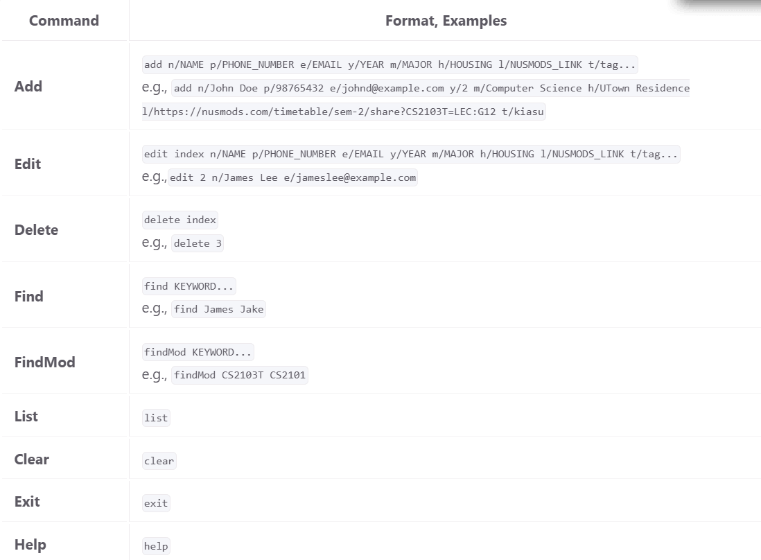
When I take a quick glance at the command summary to understand the overview of the features, I noticed that the fields are formatted the same way.
- It may be hard for users to visually distinguish between the compulsory and optional fields, as the name parameter is required but the rest are optional
Suggestion: Maybe you could standardise and put the optional fields in brackets / square brackets for easier distinction, to improve readability of the user guide
I like that the format for the Add Command in the User Guide is very descriptive and tells me which fields I can input for a new contact, but perhaps you could include a different kind of formatting that tells users which fields are compulsory and which are optional
When I take a quick glance at the command summary to understand the overview of the features, I noticed that the fields are formatted the same way.
Suggestion: Maybe you could standardise and put the optional fields in brackets / square brackets for easier distinction, to improve readability of the user guide