Note: This project is no longer actively maintained by Pinterest.
As ReactJS continues to increase in popularity for both startups and large-scale technology companies, we wanted to make it as easy as possible to add Pinterest content onto these sites. This helps both you and us. The more content you drive into Pinterest, the more traffic you get in return. React brings widgets to a whole new level, and we are excited to introduce a React component collection of our already popular Pinterest widgets.
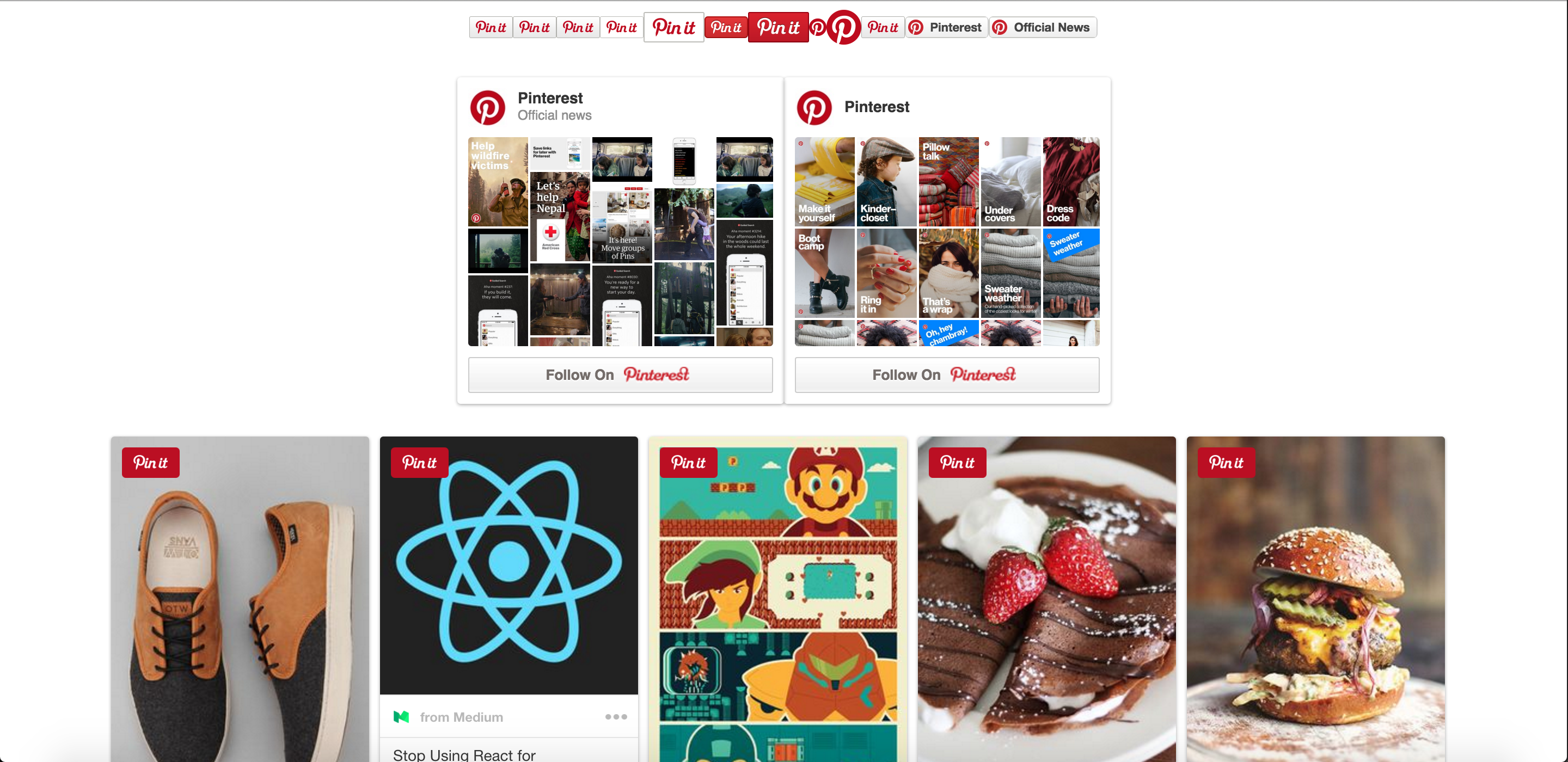
npm install react-pinterest --saveThe full list of available widgets are:
- Pin It Button
- Pinterest Follow Button
- Pinterest Pin Widget
- Pinterest Profile Widget
- Pinterest Board Widget
- Pinterest Grid
| prop | type | default | notes |
|---|---|---|---|
| type | string | 'any' | enum of { 'any', 'one' } |
| color | string | 'grey' | enum of { 'red', 'white', 'grey' } |
| large | boolean | false | is large sized button |
| round | boolean | false | is circular button |
The following props are specific for type="one". Each prop refers to the Pin to be pinned on click. If pin is specified, it will be a repin, otherwise it will create a new Pin using media, url, and description.
| prop | type | notes |
|---|---|---|
| pin | string | the id of the Pin to repin |
| media | string | the image url of the Pin to create |
| url | string | the link back of the Pin to create |
| description | string | the description of the Pin to create |
Use:
import { PinItButton } from 'react-pinterest';

// To create a Pin one Pin It button
<PinItButton type="one" media="https://goo.gl/zFFBUK" url="https://goo.gl/hQmcWP" description="Example Stuff"/>

// To Create a repin Pin It button
<PinItButton type="one" pin="356417757988637350" />

// To Create a Pin any Pin It Button: opens the image picker overlay
<PinItButton type="any" />
<PinItButton type="any" color="white" />
<PinItButton type="any" color="white" large={true}/>
<PinItButton type="any" color="red" />
<PinItButton type="any" color="red" large={true} />
<PinItButton type="any" round={true} />
<PinItButton type="any" round={true} large={true} />| prop | type | notes |
|---|---|---|
| board | string | the board slug of the board to follow (<username>/<board_name>) |
| user | string | the username of the user to follow |
Choose either a board or user to follow. If both are specificed, board will be used.
Use:
import { PinterestFollowButton } from 'react-pinterest';

// To create a board follow button
<PinterestFollowButton board="pinterest/official-news">Official News</PinterestFollowButton>

// To create a profile follow button
<PinterestFollowButton user="pinterest">Pinterest</PinterestFollowButton>| prop | type | default | notes |
|---|---|---|---|
| pin | string | required | the id of the Pin to display |
| size | string | 'small' | enum of { 'small', 'medium', 'large' } |
| lang | string | 'en' | language code for Pin |
Use:
import { PinterestPinWidget } from 'react-pinterest';

// Pin Widgets default to small
<PinterestPinWidget pin="530158187357124374" />
<PinterestPinWidget size="medium" pin="530158187357124374" />
<PinterestPinWidget size="large" pin="530158187357124374" />| prop | type | default | notes |
|---|---|---|---|
| board | string | required | the board slug of the board (<username>/<board_name>) |
| width | number | required | the width of the board widget |
| height | number | required | the height of the board widget |
| columns | number | required | the number of columns in the grid |
Use:
import { PinterestBoardWidget } from 'react-pinterest';

<PinterestBoardWidget board="pinterest/official-news" width={300} height={300} columns={5} />| prop | type | default | notes |
|---|---|---|---|
| user | string | required | the username of the profile |
| width | number | required | the width of the board widget |
| height | number | required | the height of the board widget |
| columns | number | required | the number of columns in the grid |
Use:
import { PinterestProfileWidget } from 'react-pinterest';

<PinterestProfileWidget user="pinterest" width={300} height={300} columns={5} />| prop | type | default | notes |
|---|---|---|---|
| gutter | number | 0 | the margin between grid elements |
| columns | number | ? | the number of columns to use in the grid, if unspecified it will guess based on the width of the first grid element |
Use:
import { PinterestGrid, PinterestPinWidget } from 'react-pinterest';

<PinterestGrid gutter={gutter}>
    <PinterestPinWidget pin="530158187357124374" />
    <PinterestPinWidget pin="356417757989339525" />
    <PinterestPinWidget pin="356417757986524080" />
    <PinterestPinWidget pin="356417757986724718" />
    <PinterestPinWidget pin="356417757988564358" />
    <PinterestPinWidget pin="356417757988206582" />
    <PinterestPinWidget pin="202802789445693269" />
    <PinterestPinWidget pin="89438742571585339" />
    <PinterestPinWidget pin="232850243203755319" />
    <PinterestPinWidget pin="137008013639035297" />
    <PinterestPinWidget pin="264797653065817757" />
    <PinterestPinWidget pin="144467100519920447" />
</PinterestGrid>npm install; cd examples; node server.js
Then open http://localhost:3000
Try adding a query param to change the PinterestPinWidget size ?size=medium or ?size=large
