Link to experiment. Here's a screenshot of the page it brings you to:
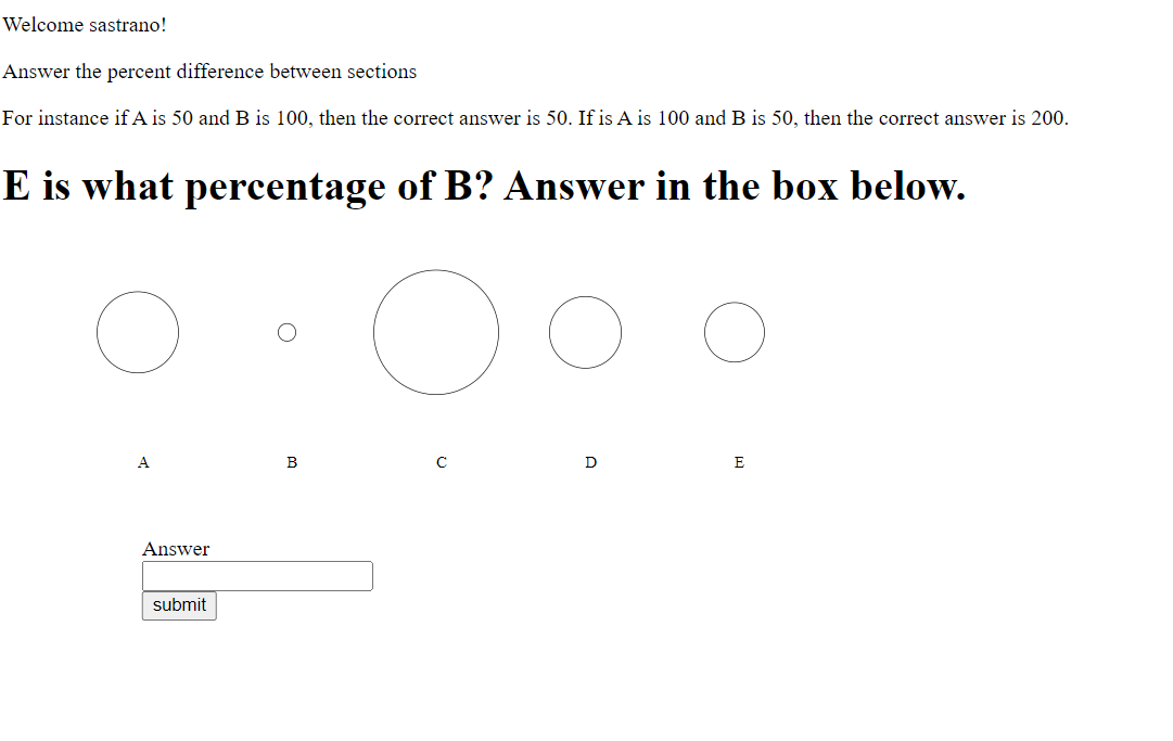
We are testing the effectiveness of perceiving different visualizations of data- bar chart, pie chart, and circle chart. In the experiment, we generate random numbers, 5 random numbers between 0 and 100
Each visualization represents the data points in different ways:
Bar chart- height of the bars Pie chart- area of the pie Circle chart- radius of the circle
During the experiment, we labeled each of the sections with letters to indicate which portions of the chart are being compared. In a random order, we show each participant the visualizations and have them guess in percentages the difference between two outlined sections.
We hypothesized that in agreeance with the Cleveland-Mcgill paper, when users are presented with different data visualizations, the data values can be most easily judged and therefore will be best understood when presented in a bar chart.
Design choice- made visualizations black and white to make it easier to see and distinguish which sections to compare so that color variance wouldn't skew the results.
We only decided to show them one trial at a time because we did not want to lose our participant's focus. Since we did not want to show the charts repeatedly, we have the option for the participant to take the trials again as many times as they would like for flexibility by easily reloading the page.
As far as implementation was concerned, cookie code was based off of these instructions. Cookie implementation was adapted from this tutorial. Lastly, the pie chart was adapted from this tutorial.
After obtaining the results from various participants, we were able to create the following visualization using a 95% bootstrapped confidence interval:
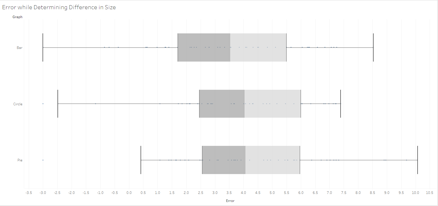
Our resulting graph was created using tableau to model the box and whisker plot shown in the Cleveland-Mcgill experiment. Despite the use of the absolute value, there were few outlying guesses that resulted in negative values, however the results of the experiment largely reflect that of Cleveland-Mcgill, that Bar charts are the easiest metric for participants to accurately judge distances. This proves our hypothesis that users will find the bar chart easiest to comprehend.
-Cookie Feature- Cookies are stored properly so that you have to fill out the cookie on desktop -Google Sheet Integration- Google Sheet populates with Results: have two different forms, a hidden form for the data we want, the other form is the form you see: Google Sheets make the CSV file a lot more accessible to those wanting to access it. -Calculations for the expected vs actual user response are included within code
Our visualizations have a prompt where you can input a username that gives the interface a more personal feel. When you log back in, you are prompted with a welcome message and are able to take the trials as many times as you'd like. You're able to seamlessly click from visualization to visualization after responding all on one web page. The data is randomly regenerated each time to ensure that the user's ability to judge differences is accurately measured each time.
a3-SophiaStrano1-JustinMoy-CarleyGilmore